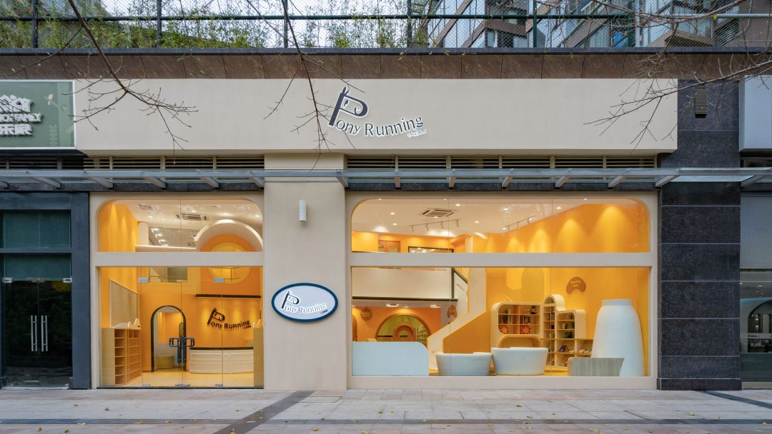
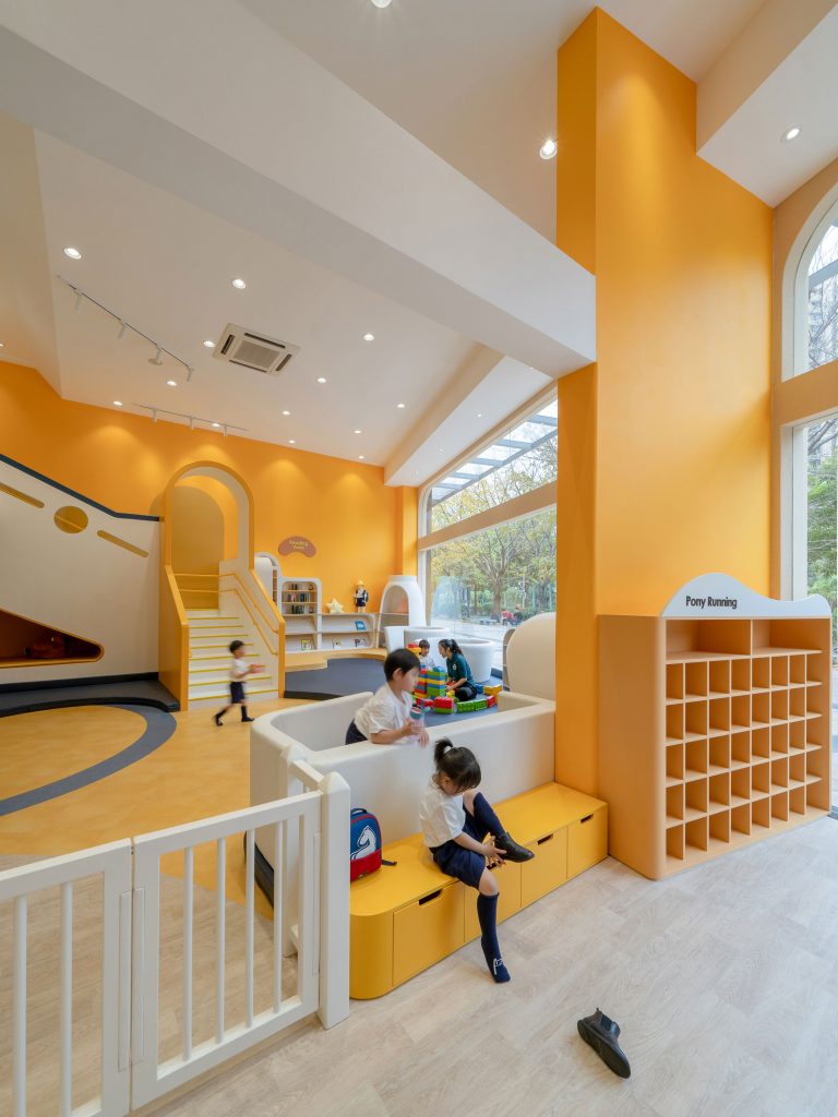
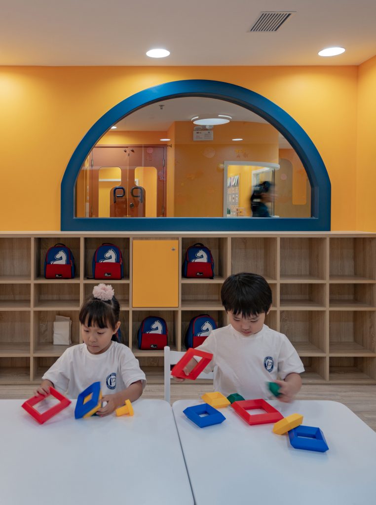
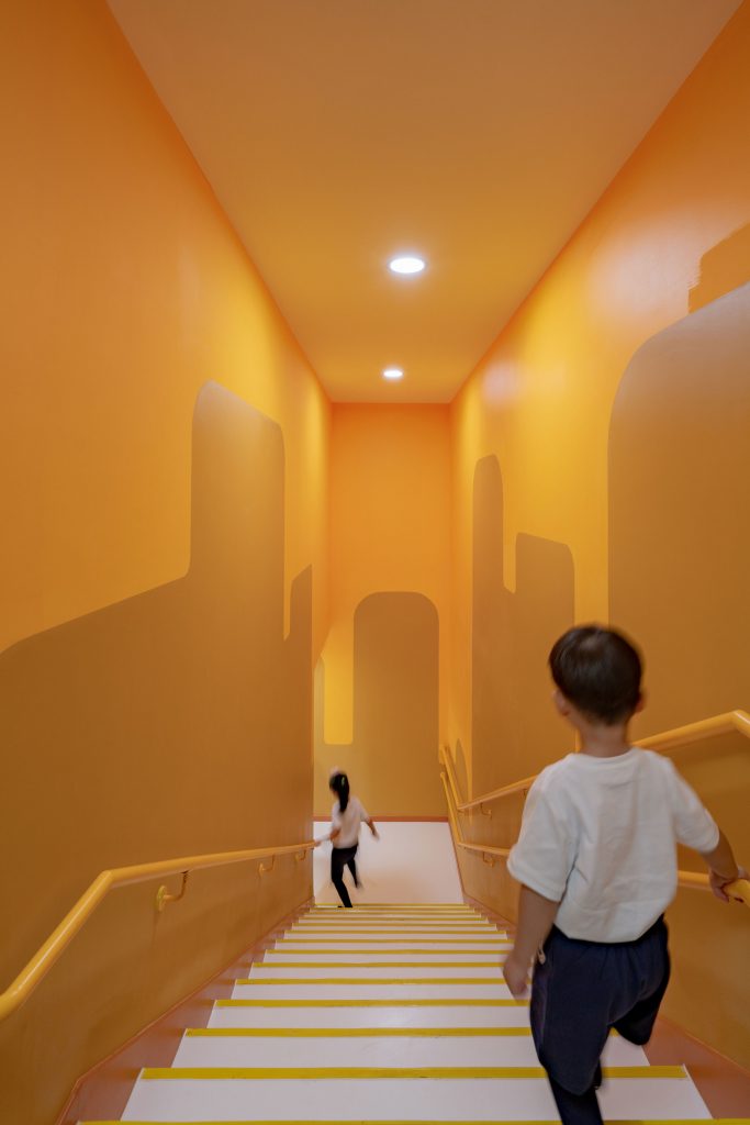
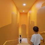
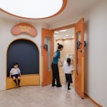
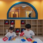
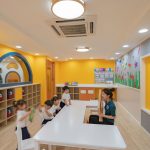
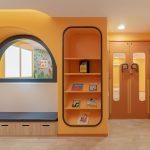
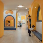
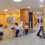
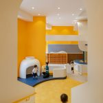
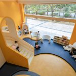
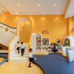
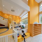
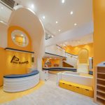
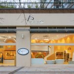
Located in Shenzhen city’s Nanshan district, the 626m² Pony Running Daycare by VMDPE Design, led by Vinci Chan, and assisted by Sean Ve, Dio Chang, and Nancy Lu, is a fun-oriented and safe space for young children. Transparent glass separates the shiny and bright yellow interiors from the sober grayness of the city outside and the concrete built environment. The learning space has been designed such that it provides opportunities beyond the boundaries of traditional thinking, granting children the freedom to move, explore, and grow in an inspirational setting.
As an early childhood education institution, Pony Running is recognised for its rich teaching system. A small class structure stands at the core of its educational concept, focusing on optimising the personality needs and potential of every child.
To perform the brand upgrade, VMDPE Design was inspired by the emerging approach of an “Earth Building” found in the Western architectural “School of Natural Life”. Based on the natural disposition of children, the use of adult “decorative” techniques was completely abandoned, highlighting the beauty and fun of the building itself, while still allowing children to exercise their inquisitive minds and have fun.
In terms of material selection, a large number of environmentally-friendly materials were integrated into the design language, demonstrating the sustainability philosophy of the designers and educators. In terms of colour selection, colourful schemes were rejected in favor of a main tone that enhances the appeal of the environment. Such positive psychological and emotional suggestions are transmitted to the outside world through the floor-to-ceiling glass façade, creating a curbside appeal among the local community.
Keeping function at the core of the modern educational space, shapes have been reduced to their minimum expression, focusing on architectural content on didactic functions and activities for children. On this basis, both spatial integration and colour matching use the “simplest” techniques to highlight a natural and essential temperament.
“We always imagine ourselves as kid who wants to have fun and explore. I would like to have a space with safe and gentle feeling, a corner for myself, to hide, read and imagine. We’ve been trying to make this happen, and then we got the answer we wanted from the smile of the kids.” — principal designer Vinci Chan
You might also like:
LAVA architects designs eco-friendly Vietnam kindergarten with colourful circular cut-out windows
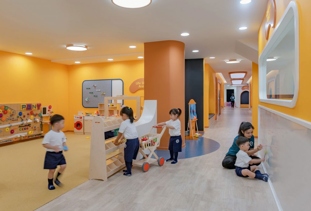
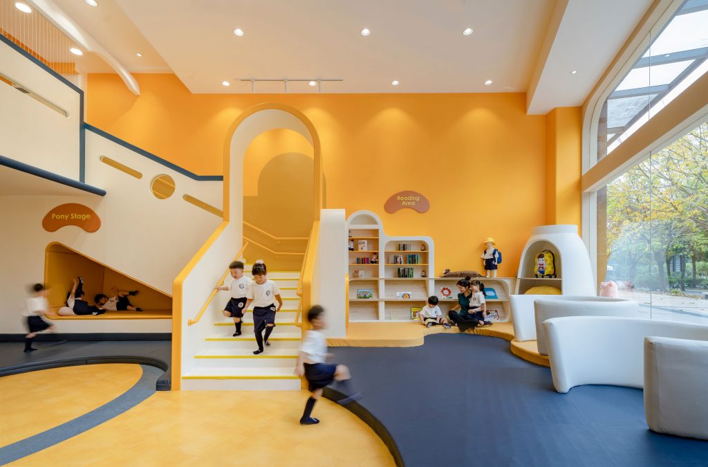
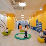
“Use the space itself to create purpose and beauty, revitalise spatial use, and put it at the service of the user,” says principal designer Vinci Chan. The spatial design of the project goes against that of most nurseries in China, reserving one-third of the site as a dynamic integration of the social area, the reading area, the science area, and the role-playing area.
The entire social area adopts an open design that arranges several corners called “nests”, where children are free to choose their favorite location at any given time. The scale of the space has been carefully balanced, designing all corners in a way that allows teachers to observe, while transmitting children a comfortable feeling of privacy. Furthermore, everything from materials to the design style has been carefully considered to provide a high degree of safety in the area. This allows children to move freely, while teachers participate and guide activities on the side.
See the full gallery here:

