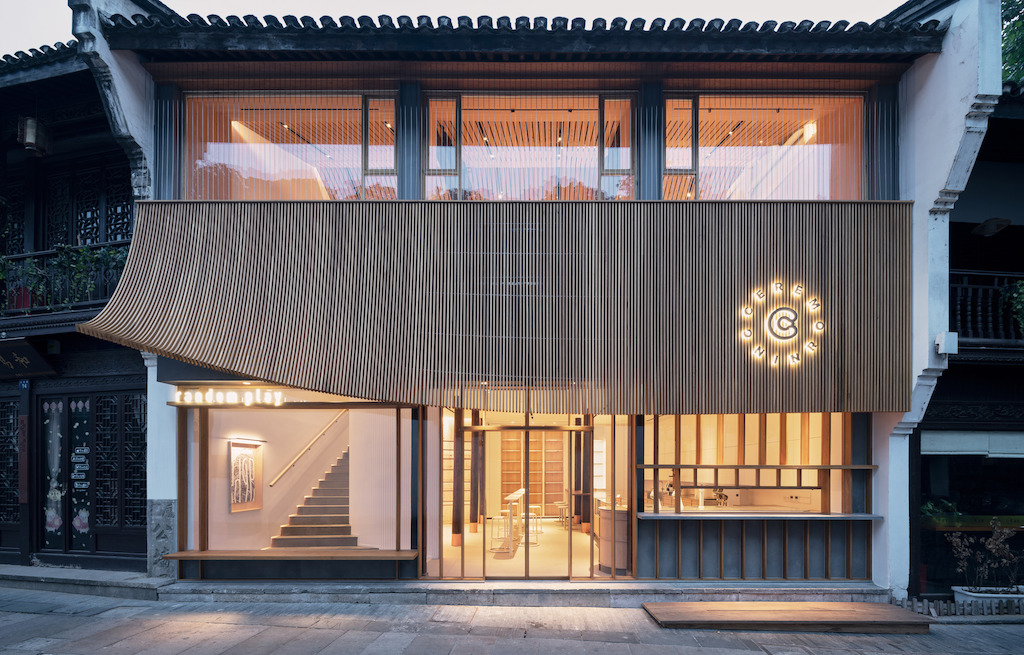
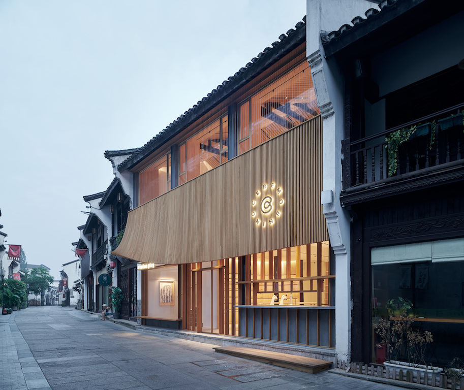
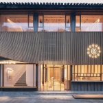
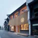
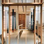
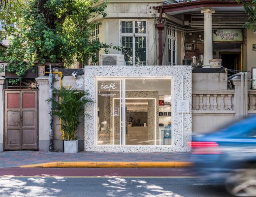
Air Studio has designed a 150m² integrated F&B and art gallery space for local lifestyle brand Random’s two sub-brands – Ceremorning and Random Play in Hangzhou. Located in the city’s Dajing Lane, the two-storey project is sited in an area known for its architecture inspired by the Ming-Qing dynasty.
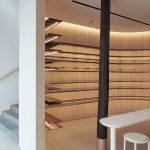
The lower space is designed specifically for “Ceremorning,” a cafe that serves light snacks and coffee, while the upper floor is designated to “Random Play’s” art display and exhibition. Air Studio team of architects – Jie Su, Xin Liu, Haochi Zhang and Tianyu Wang – has designed the space with the aim of placing two sub-brands vertically in the allocated space and showcase their independence by dividing and layering up space. However, the team has also worked with unified design concepts and architectural elements which highlights the interdependence of the two sub-brands.
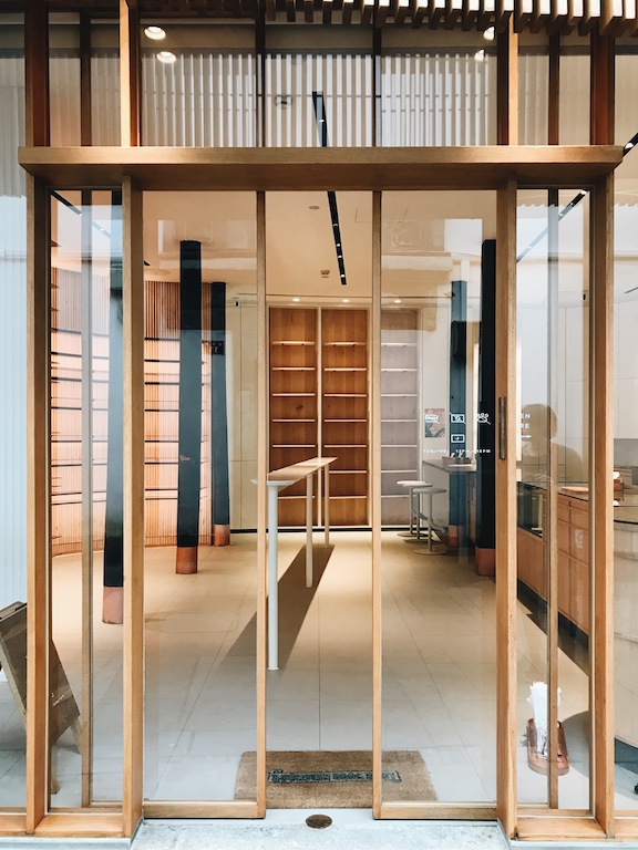
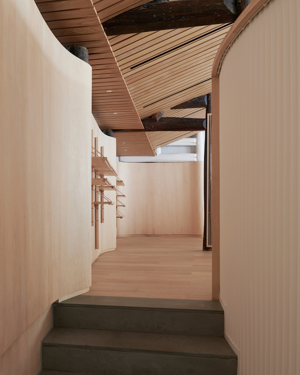
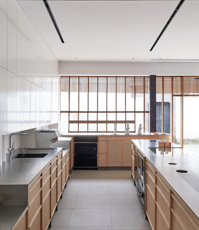
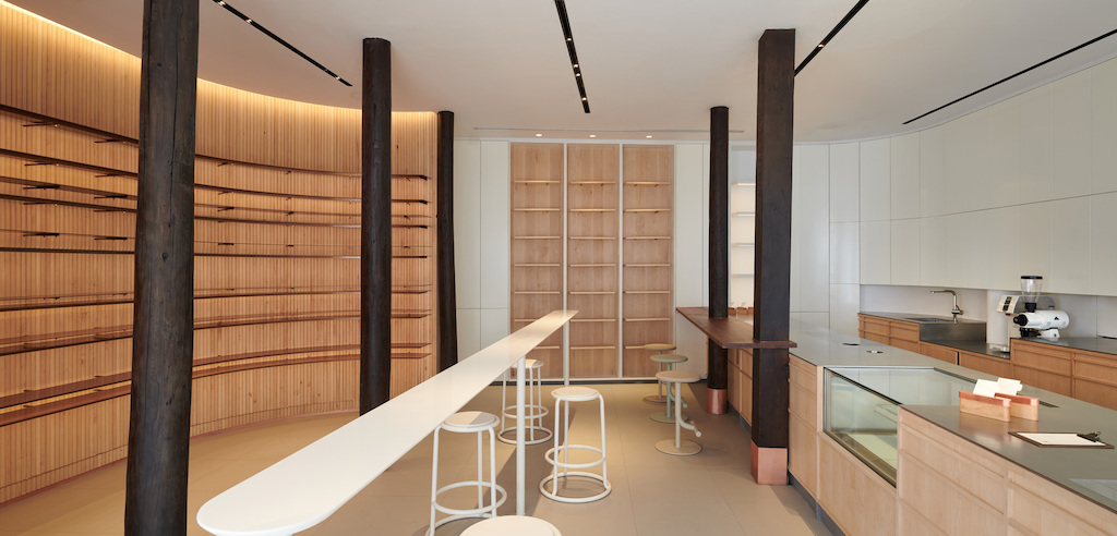
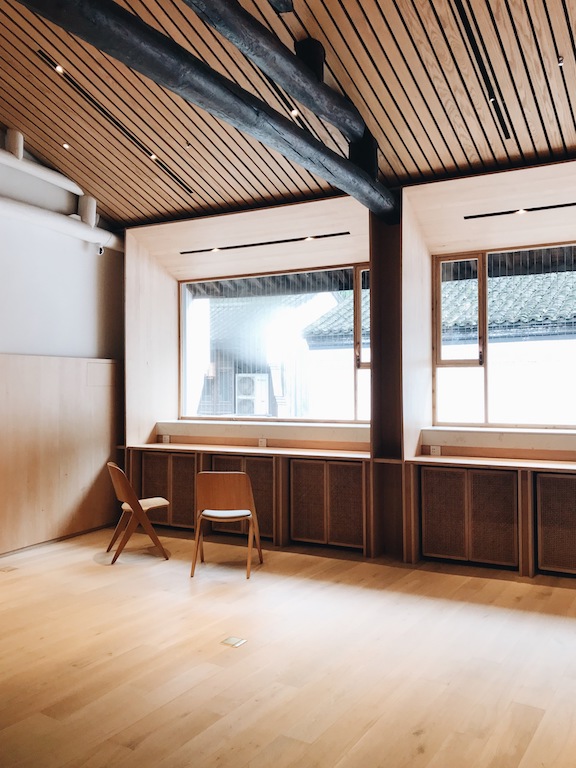
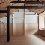
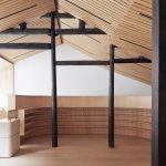
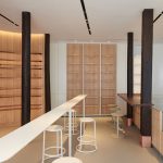
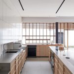
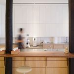
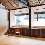
A sensorial experience has been envisioned with the help of materials – with wood being the primary material as it possesses the most suitable temperature characteristics for people to interact with it physically. It has been used in the design of the facade so that the project could better blend in the context by responding to the ancient architectural style in the surrounding area. Within the interiors of the project, the team has created a space with different layers of materiality by employing different scales of wooden objects.
You might also like:
KEAB architects designs vertical art gallery in traditional Busan market to preserve its heritage
OPEN Architecture converts decommissioned aviation fuel tanks in Shanghai into inclusive art complex
Radius Interior Design Studio creates skateboard-inspired cafe in Taipei
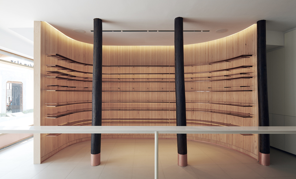
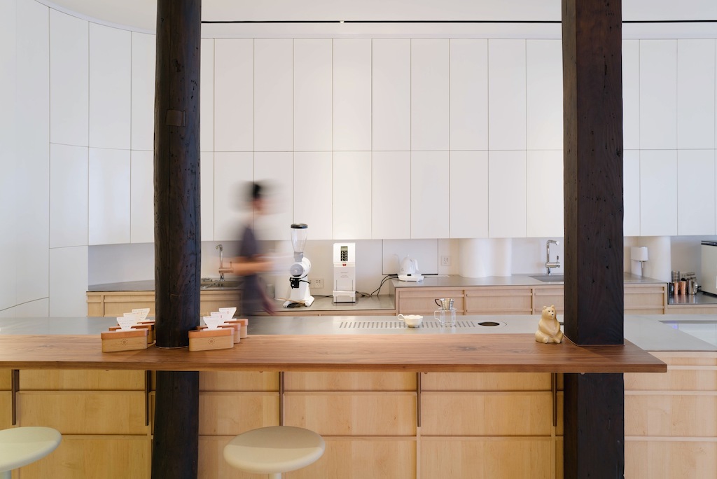
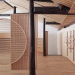
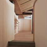
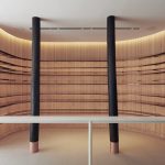
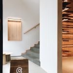
While preserving the historic context, the firm also successfully creates a dialogue between the traditional and the contemporary, the old and the new. The curved walls connecting the first and second floors are formally inspired by the western cylindrical order, and the space enclosed by the curved surfaces is a detachment that takes into consideration the two Ming and Qing wooden pillars standing in front of it. The juxtaposition of two vastly different styles provides a contextual basis even as it offers a more modern identity.
The shifting light and shadow interplay at the entrance of the artistic environment, and the sense of “formality” respond well to the integration of culture and the transition of space. The material used here is called Corian, which is a composite stone. Unlike conventional stone materials, this composite material can be reshaped and remodeled by heat bending, making the curved wall an entirely seamless piece.
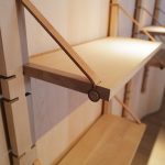
The practice has also taken charge of every aspect of the project, ranging from the more macro space design to the micro-design of the linear tables and curved display racks. The comprehensive involvement ensures that the composition of the overall space is cohesive and well-crafted as an assemblage of art pieces in their respective orders.
See the full image gallery here:
- Processed with VSCO with a6 preset
- Processed with VSCO with a6 preset
- Processed with VSCO with a6 preset
- Processed with VSCO with a6 preset
Photos: Hao Chen

