The recently concluded World Architecture Festival that took place in Amsterdam from December 4 to 6 has announced the list of winners for its coveted Building of Year awards in various categories. While the selection features a good mix of projects from around the world, Asian countries are well represented in a number of categories. Here are a few of those that walked away with awards beating stiff competition from entries around the world.
Dream & Maze, China by Studio 10
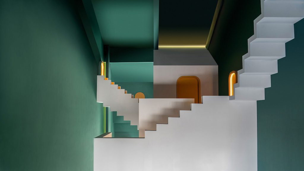
Studio 10, a two-year-old architecture practice based in Shenzhen and Hong Kong, was founded by Zhou Shi, who has worked in the past with Kohn Pedersen Fox in its New York offices. She has worked on high profile projects such as Shenzhen Bay 1 and Pulian, Technology R & D Headquarters, Qianhai Hony Center, Beijing Huadu Center, Nanjing Global Trade Center, London Canary Wharf BP-4, and New York Hudson Field Complex.
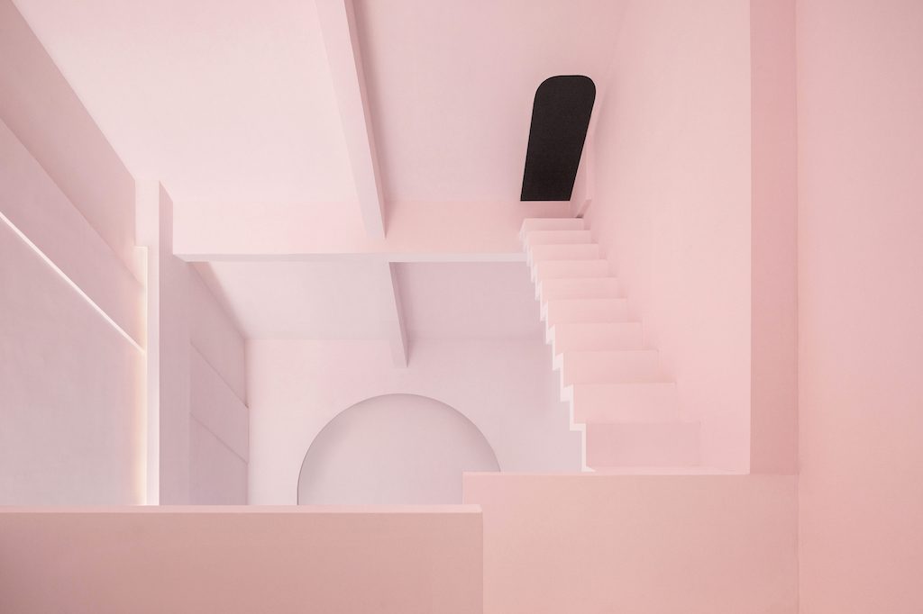
Dream and Maze are themed guestrooms within a guesthouse called The Other House located by the Li River in Pingle County, Guilin. Inspired by the works of M.C. Escher, the architect meant to create a mysterious, infinite and impossible space with the seamless transformation amongst 2D and 3D as well as optical illusion elements.
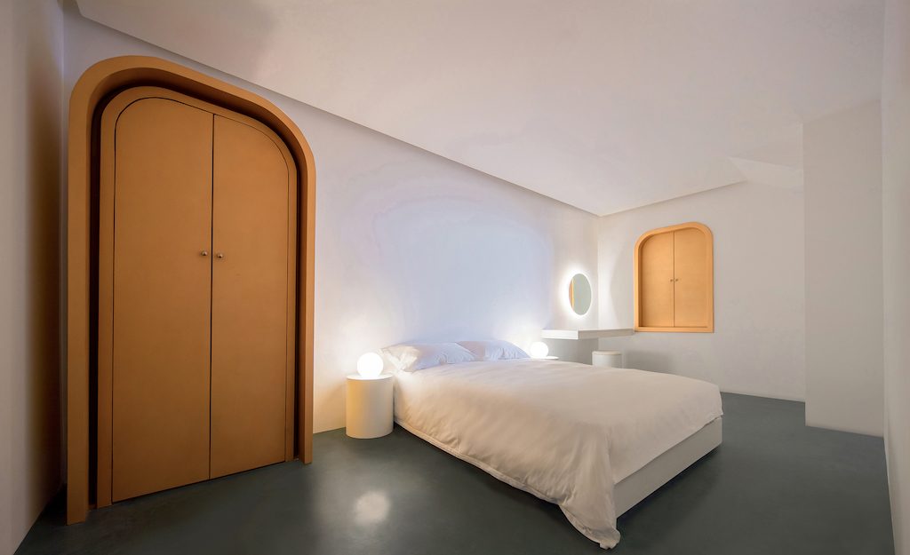
Pale pink and white colour palette renders the interior space serene and surreally fresh, far from the chaos of mundane daily life. All mod-cons such as lighting fixtures and electronic appliances have been concealed behind a series of black-painted doors, maintaining the pristine, chimerical nature of the space.
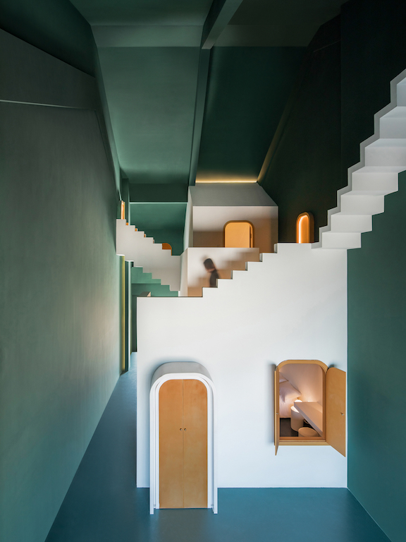
In the other forest-green-themed room, anti-gravitational stairs lead to golden doors, producing some unexpected results.
Photos: © Chao Zhang
UCCA Dune Art Museum, China by Open Architecture
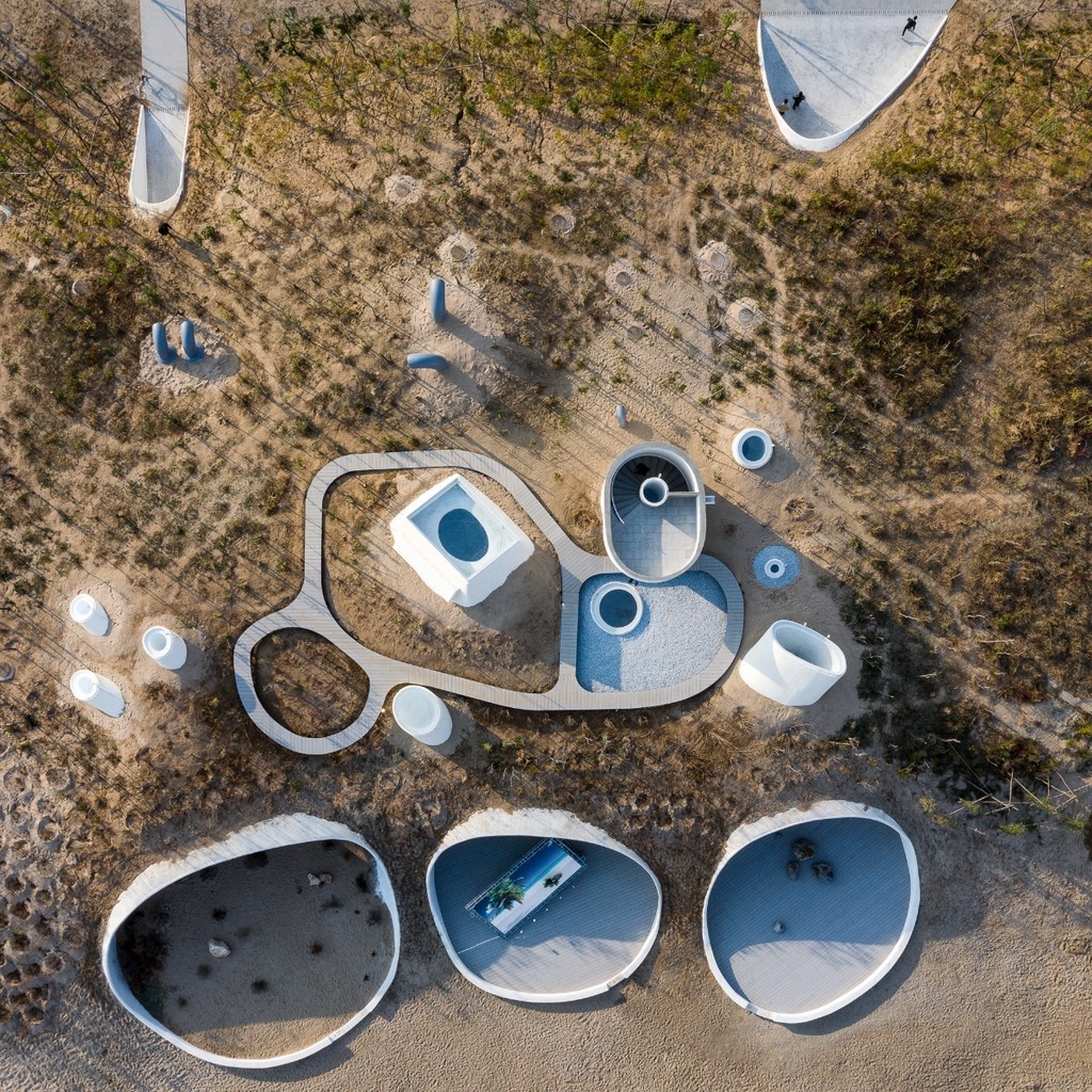
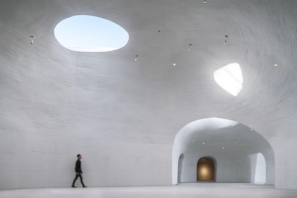
The UCCA Dune Art Museum, located on a quiet beach along the coast of northern China’s Bohai Bay in Qinhuangdao, is carved into the sand, almost disappearing into the landscape. Countless years of wind have pushed the beach’s sand into a dune along the shore several meters high, stabilised by low-rising shrubs and other ground cover. Inspired by children’s tireless digging in the sand, the museum lies beneath this dune.
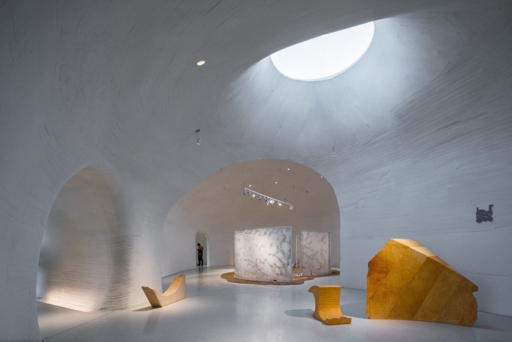
“Digging” creates a series of interconnected, organically shaped spaces which, enveloped by sand, resemble caves—the primeval home of man, whose walls were once a canvas for some of humanity’s earliest works of art. Hidden between the sea and the sand, the design of the Dune Art Museum, commissioned by real estate developer, Aranya, is simple, pure, and touching—a return to primal and timeless forms of space.
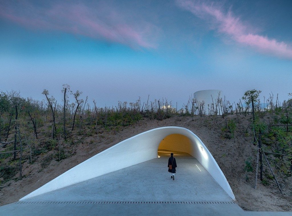
The decision to create the art museum underneath the dunes surrounding it was born out of both the architects’ deep reverence for nature and their desire to protect the vulnerable dune ecosystem, formed by natural forces over thousands of years. Because of the museum, these sand dunes will be preserved instead of leveled to make space for ocean-view real estate developments, as has happened to many other dunes along the shore.
A series of cell-like contiguous spaces accommodate the Dune Art Museum’s rich and varied programs, which include differently-sized galleries and a café. After passing through a long, dark tunnel and a small reception area, the space suddenly opens up as visitors enter the largest multifunctional gallery. There, a beam of daylight from the skylight above silently yet powerfully fills the space.
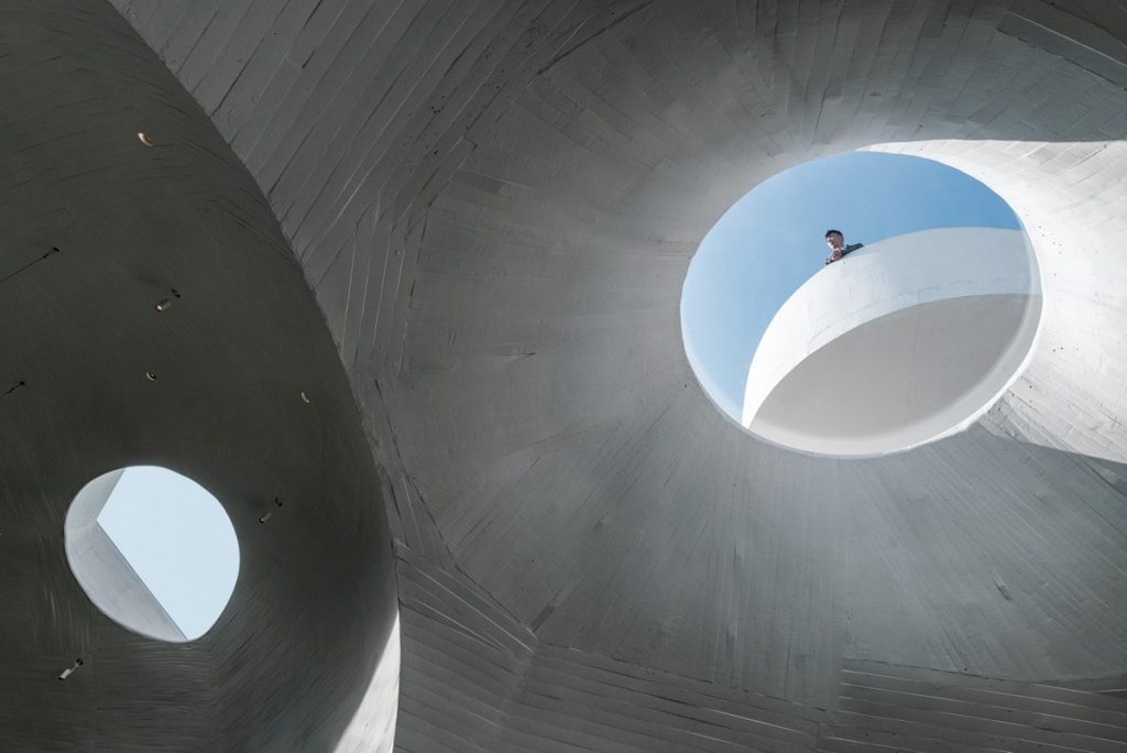
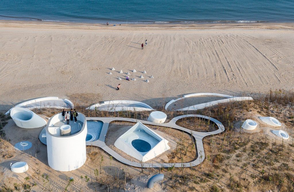
Looking through different openings framed by the building, museum-goers can observe the ever-changing expressions of the sky and sea throughout the day. A spiral staircase leads to a lookout on top of the sand dune, guiding curious audiences from the dark recesses of the museum’s cave-like galleries to the vast openness above. Hidden between the sea and the sand, the museum emerges as a hidden shelter, intimate to the body and soul—a place to thoughtfully contemplate both nature and art.
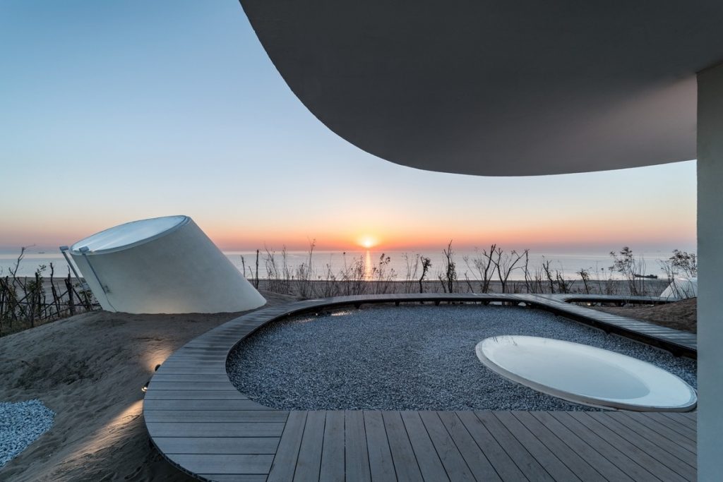
The complex three-dimensional geometry of the Dune Art Museum’s concrete shell was shaped by hand by local workers in Qinhuangdao (some of whom were former shipbuilders), using formwork made from small linear strips of wood and other materials. The architect deliberately retained the irregular and imperfect texture left by the formwork, allowing traces of the building’s manual construction to be felt and seen. In addition, the building’s doors and windows, reception desk, bar counter, and bathroom sinks are all custom-designed and made by hand. The eight tables in the café are also designed by the architect, each with a distinct shape matching that of the floor plans of the eight main gallery spaces.
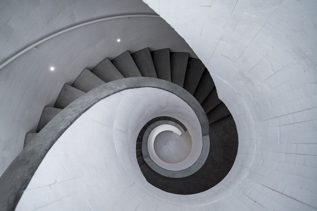
The building’s many skylights, each with a different orientation and size, provide natural lighting for the museum’s spaces at all times of the year; its sand-covered roof greatly reduces the building’s summer heat load; and a low-energy, zero-emission ground source heat pump system replaces traditional air conditioning.
In the near future, a long walkway will be built opposite the Dune Art Museum, extending into the ocean. During low tide, when the pathway is accessible, visitors can walk to the Sea Art Museum, which will rise out of the sea like a solitary rock – with the two museums creating a harmonius dialogue by the sea.
Photographs: Qingshan Wu, Nan Ni
MORPHEUS HOTEL, MACAU (SAR) by Zaha Hadid Architects
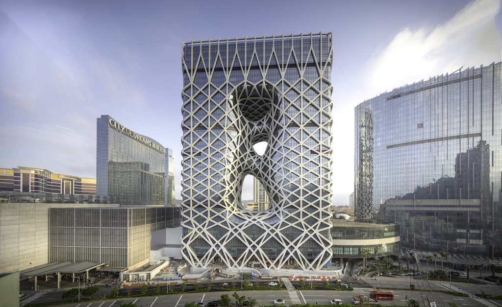
Informed by the fluid forms within China’s rich traditions of jade carving, the Morpheus’ design combines dramatic public spaces and generous guest rooms with innovative engineering and formal cohesion.
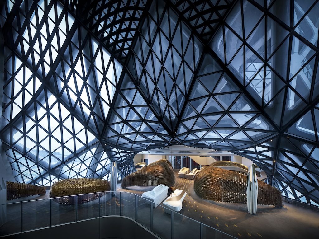
Conceived as a vertical extrusion of its rectangular footprint, a series of voids is carved through its centre to create an urban window connecting the hotel’s interior communal spaces with the city and generating the sculptural forms that define the hotel’s public spaces.
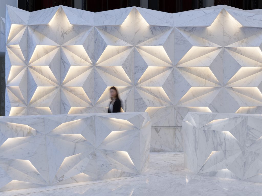
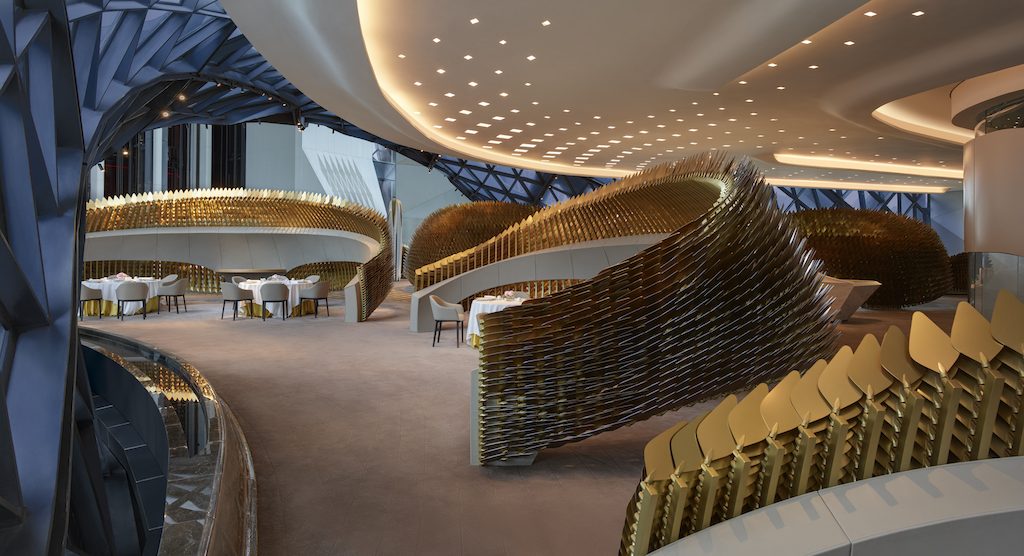
Linked at ground level with the surrounding three-storey podium of the City of Dreams resort, the Morpheus, spanning 148,000m2, houses 770 guest rooms, suites and sky villas, and includes civic spaces, meeting and event facilities, gaming rooms, lobby atrium, restaurants, spa and rooftop pool, as well as extensive back-of-house areas and ancillary facilities.
Photos: Ivan Dupont, Virgile Simon Bertrand
Maya Somaiya Library, Sharda School, India by Sameep Padora & Associates
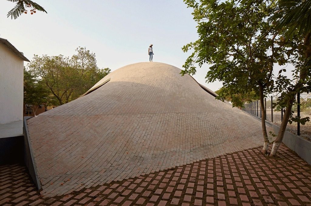
The site chosen for this small addition of a children’s library within a school in a rural town called Kopargaon in western Indian state of Maharashtra, was a sliver between existing buildings and the school boundary, a site that almost implied a linear building footprint to adjust the program for the chosen site.
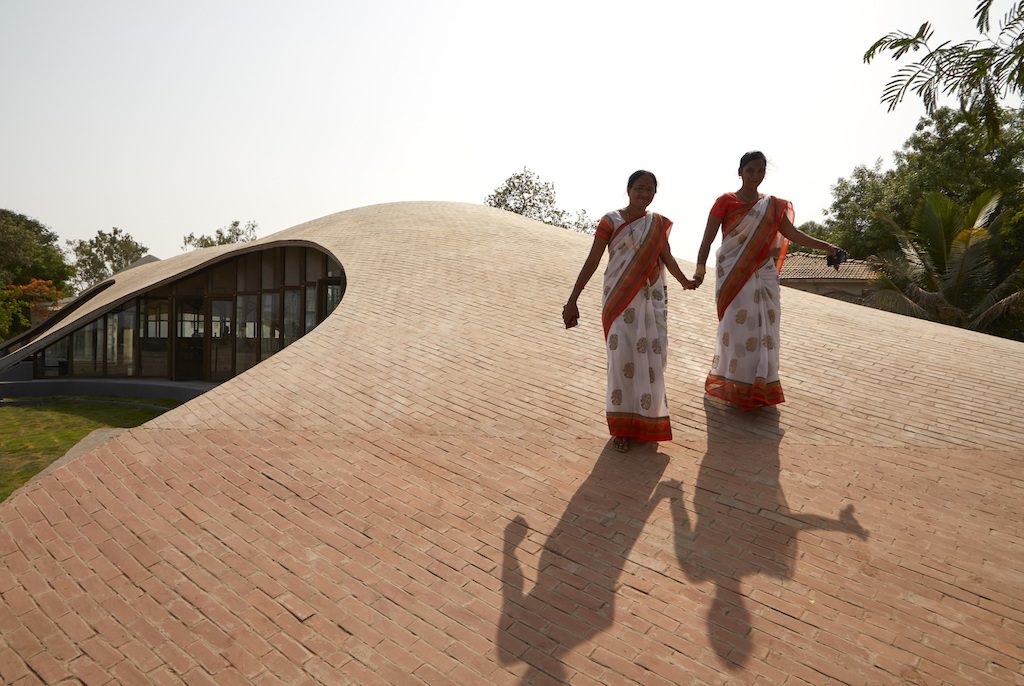
Alluding to the impetus that children have towards landscape over a building we imagined the library building to be a formal extension of the ground plane. A place inside for study and a place above for play. With the limited teaching resources available in the larger vicinity we needed the inspiring spatial experience to be a magnet to attract students and hopefully other residents from the nearby settlements after school hours.
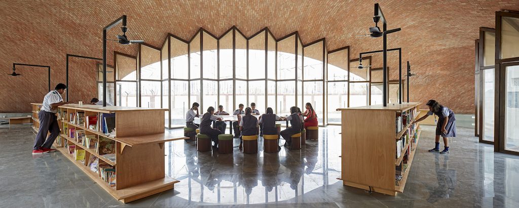
When the architects first visited the site, they discovered geodesic structures built by an engineer for a few of the school buildings. Encouraged by this to pursue a project that followed from contextual construction intelligence, the architects parsed through several possible material configurations ranging from concrete shells to brick vaults for building this ‘architectural landscape’.
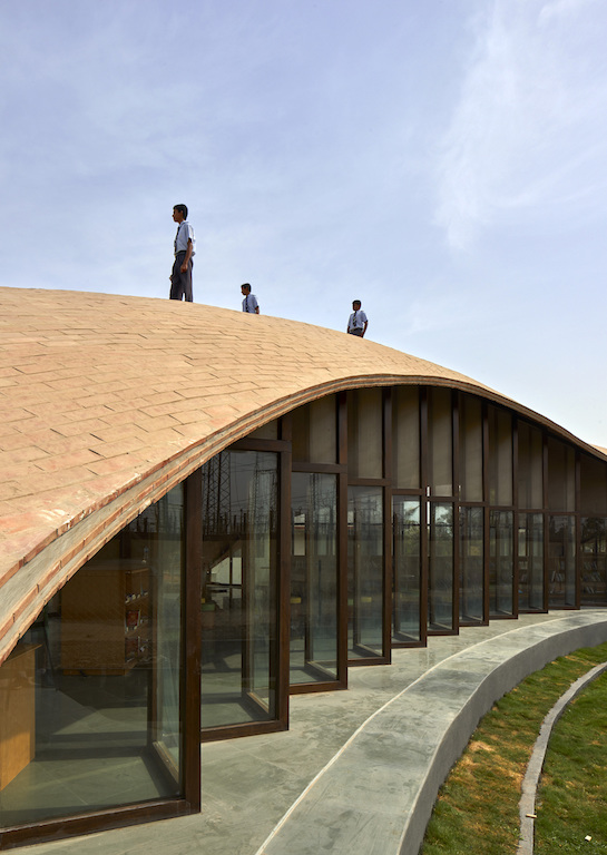
The team found further material inspiration in the Catalan tile vault from the 16th century, especially its use by Gustavino in the early 19th century as well as the incredible details from the work of Eladio Dieste from the mid-20th century. While working with the specific site condition, the team used Rhino Vault developed by the Block Research Group at the ETH to articulate a pure compression form for the project.
The library lies at the intersection of a students’ daily routine it became a pavilion accessed from multiple sides with students potentially engaging with books while traversing through the library or over it. The library interior has varied spatial and seating systems, a floor stool system towards the edges for a more intimate study area and towards the centre, tables and stools for collaborative study. The self-structured window bays are striated profiles for increased stability with economical window section sizes.
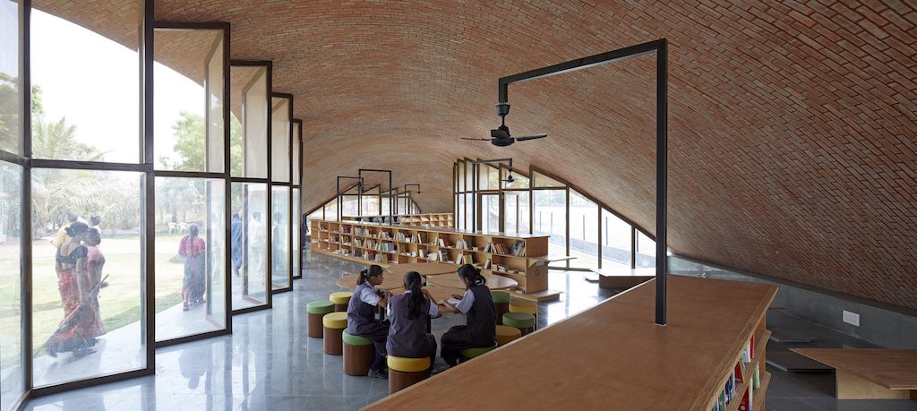
The construction technology for the project also makes a case to reexamine the age-old binaries of the global and local as being in opposition. The regional or the local within the South Asian paradigm typically manifests within strict formal constraints of traditional styles. This is often at the expense of material efficiencies.
The team attempted to search for a material and construction efficiency in brick tile to leverage the local and regional knowledge while viewing it through a global prism.
In using principles ranging from the Catalan Tile Vaulting system to the compression ring detail from the work of Eladio Dieste in Uruguay, to using a form-finding software plug-in made in Switzerland, the library is a result of not only lessons learnt from various geographic locations but also various lessons through time and history.
Photos: Edmund Sumner
Weihai Hospital of Traditional Chinese Medicine, China by GLA
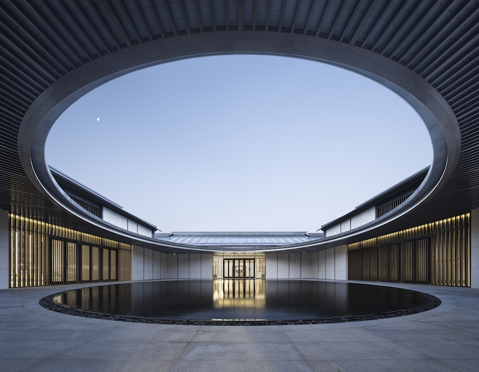
The 8,000m2 hospital, located in Weihai in China‘s Shandong province, is a comprehensive health care facility, and enjoys three main parts: programme exhibition centre of the East New Town, Kangyang Yile Sanatorium and Medical Care Houses.
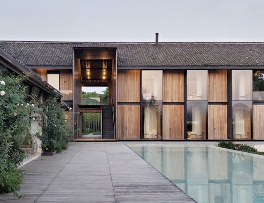
The original site of the hospital is an area of bungalows which had long fallen into disrepair. The decision of choosing this site aims at preserving the surrounding pinus thunbergii forest. Inspired by the traditional courtyards in northern China, the architects have updated the project with a contemporary expression.
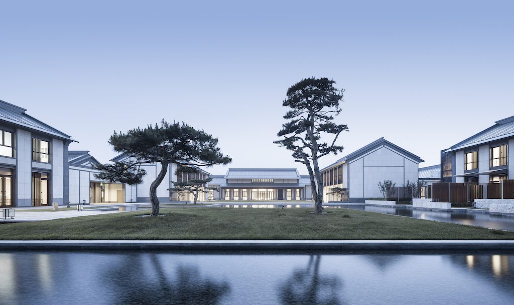
The designers sorted out the scale, sequence and framework in a typological way, classifying the Chinese courtyard into a courtyard with four walls, a courtyard with two walls and two buildings facing each other’s counterpart, a courtyard with four buildings on each side. According to the conditions of the site, different types of courtyards have been connected together by the corridor on the north-south axis and the east-west axis, thus reproducing the sense of layer after layer tour experience of Chinese traditional courtyard. Taking advantages of this site, these classified courtyards enclose the half-open central garden which faces the pinus thunbergii forest, while two wide-open gardens with different width divide the central garden into two parts: the half-open court and the water court with a larger open space. With buildings or walls enclosing courtyards and courtyards enclosing gardens, the multistage nested of different-type courtyards provide people a rich spatial structure experience.
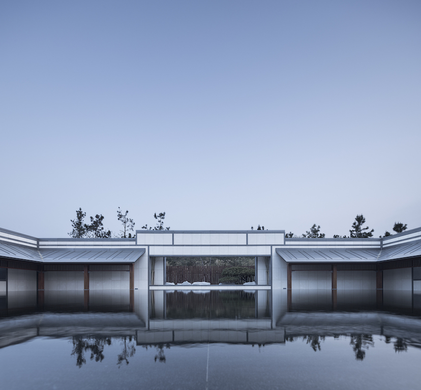
The main design of the construction inherits the basic form of traditional northern architecture. As for the choosing of the building materials, more contemporary materials such as up-right lockrand of aluminum-magnesium-manganese, steel and wood binding components, and stones with better weather ability are used to replace traditional grey tile, grey brick, and wood. Considering the properties and structural characteristics of the material, more simple and contemporary architectural designs are used on the construction details and components to restore the traditional architecture style.

The main entrance and porch which are symmetric to the north-south going axis are very beautiful. The concise mirror waterscape and the reflection in the water naturally match to the function and entrance scene of the hospital. The west-facing sub entrance is constructed with square courtyards, corridors with eaves and window walls, which shapes an understate guidance way.

The second courtyard on the north-south direction is another type, surrounded by round corridors with eaves. The fitting circular patio and quadrangle courtyard reflect the simple philosophy “a square earth and spherical heavens, harmony between man and nature” in Chinese culture. Collecting from the rain, the waterscape in the courtyard presents different qualities of warmth and solitude when in the wet season and drought period.
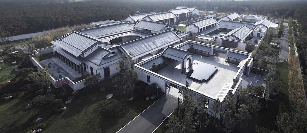
The main body of the construction presents an inverted “Y” shape by using the combination of traditional flush gable roofs, double slope tops and few gable and hip roofs. The material of the roof is aluminum-magnesium-manganese plank, smooth and neat. The construction of the façade lays stress on the interlacing of vertically divide lines, white walls, vertical landing window and vertical wooden color metal grille. The structure simplifies the double-deck building and casts a true-or-false reflection with the walls made of pure stones.
Photos: Li Yao
Future Towers, India by MVRDV
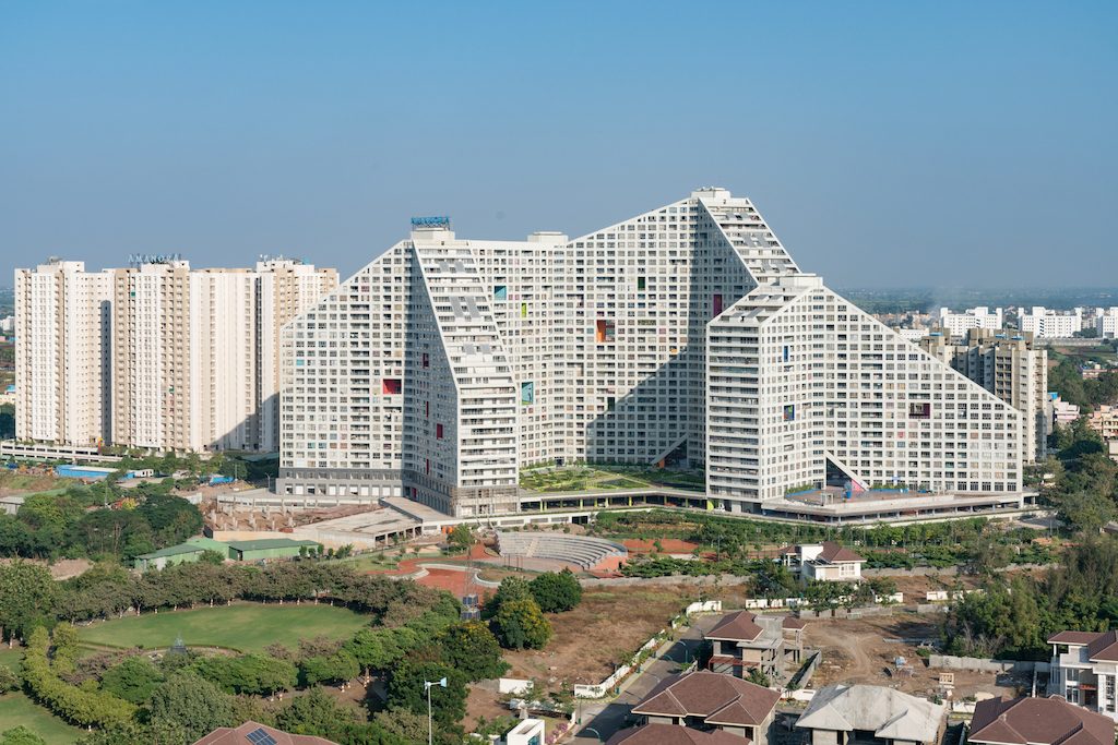
Located in Pune, India’s eight largest city and one of the fastest-growing cities in the country, Future Towers provides 1,068 apartments for a diverse section of the rapidly expanding population, a true vertical village that houses around 5,000 people in one building.
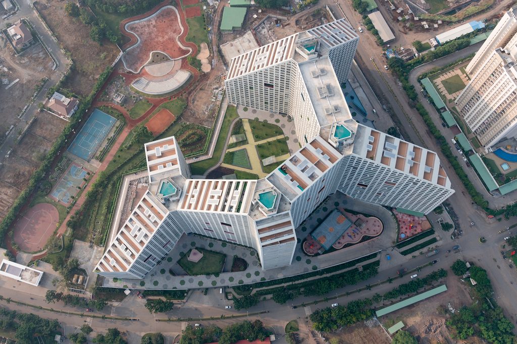
Future Towers is a part of Amanora Park Town, a community created in 2007 thanks to legislation passed in 2005 by the state of Maharashtra to encourage the development of residential “townships” near its cities. In Pune, these townships help to house the young professionals attracted to the city by its auto-manufacturing and technology sectors but, as with much of the rapid development all over India, many of the new buildings on Pune’s outskirts are generic, repetitive residential towers. In just 11 years, Amanora Park Town has grown to over 25,000 residents by focusing on a diverse, high-quality mixture of towers alongside low-density villas. But the pressure to expand faster with more high-density, low-individuality housing was ever-present.
MVRDV’s design for the Future Towers aimed to offer an alternative to this pattern, while still delivering apartments at the usual low price (since competition for new residents between different housing developments is fierce). Instead of a cluster of freestanding buildings, MVRDV’s response to the brief was a singular mountainous structure with peaks and valleys, under which all the apartments are unified in one building. However, despite its expressive appearance, the design of Future Towers, in fact, stems from a series of methodical decisions based on MVRDV’s research into Indian housing.
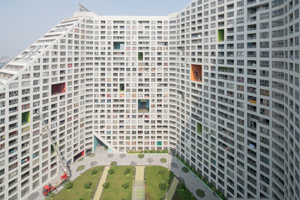
A critical deviation from the norm was to convince the client that the entire development would be more vibrant with a mixture of different units. This way, the building would ensure that users from the full spectrum of India’s exploding middle class all mingle—including young, mobile professionals who are new to the city; older, established residents; and families both large and small, all at a range of income levels. Apartments ranging from 45m2 to 450m2 are mixed together, a diversity enabled by the building’s mountainous shape and the shifting floor plans that it generates.
In Asia cities are growing so fast, and uniform repetitive residential towers are the norm”, says Jacob van Rijs, principal and co-founder of MVRDV. “With our design, we are making an effort to offer more variety and bring people from more different backgrounds together. In the original master plan, 16 separate towers were planned, all of which would have more or less the same type of apartments. The MVRDV team thoroughly researched modern Indian housing and came up with a system to create a mix of different types of apartment inside one building. This project will attract residents with a variety of incomes, something that will benefit the diversity of Amanora Park Town. Thanks to the client’s willingness to try something new, the efficiency needed for mass housing has been achieved without cutting back on residents’ comfort.”
Because construction costs are low in India, and elevators comparatively expensive, the economics usually applied to residential design could be inverted; thus a reduced number of lift cores combined with corridors were in this case more economically desirable than having many towers, each with its own core and fewer corridors. As a result of this calculation, MVRDV’s design features nine housing wings ranging from 17- to 30-storeys arranged around just four circulation cores.
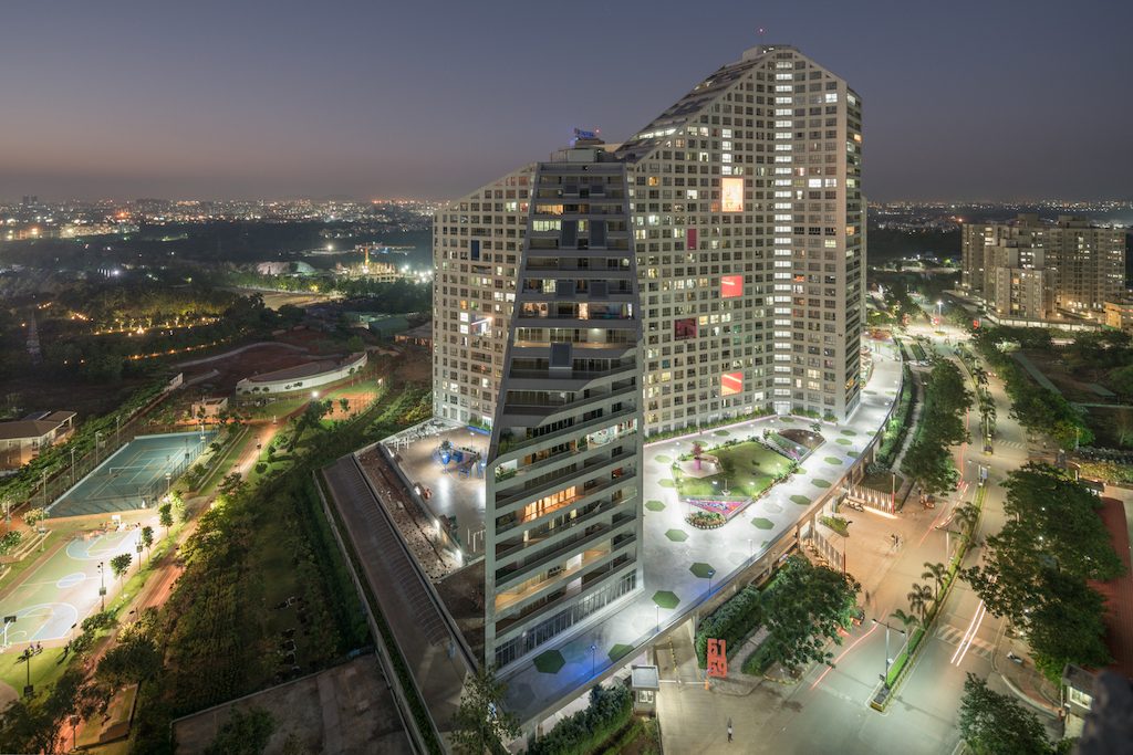
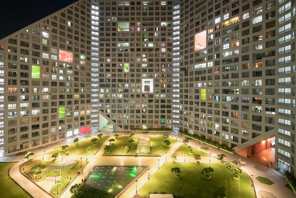
The slabs form a hexagonal grid, which allows for wide views from the apartments and leaves large open public courtyards at ground level. The ‘peaks’ allow for optimised daylight conditions and the resulting inclined roofs allow for a number of exterior terraces, both private and communal. Recessed balconies on the main facades of the residential slabs themselves hint at the diversity of the homes behind, with a mixture of normal size, double-height, double-width and even some L-shaped balconies.
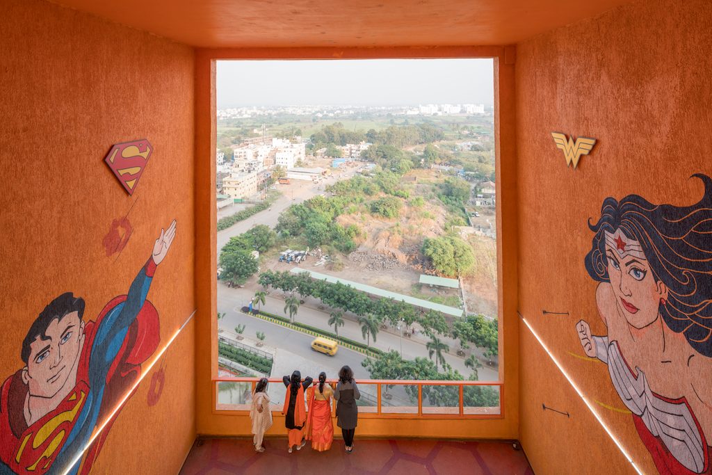
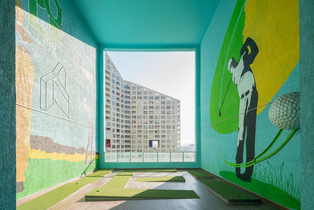
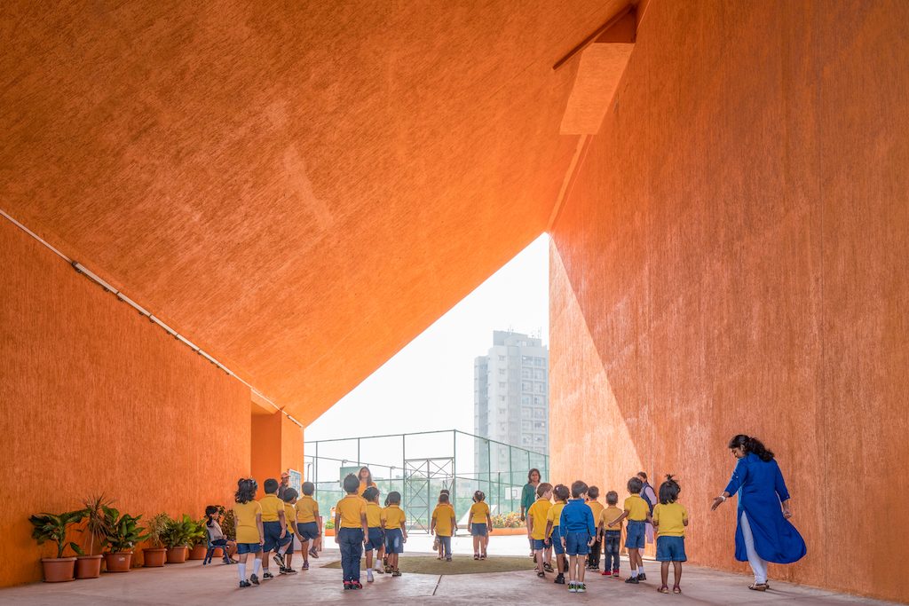
The strong graphical appearance created by the balconies is accentuated by large, brightly coloured openings known as “scoops” that puncture the building’s façade to connect with the central corridor, providing public meeting spaces and cross ventilation in all communal spaces in the process. These spaces—which originated in the need to provide refuge spaces to meet the fire code requirements for long corridors—help to give a sense of “neighbourhood identity” to different parts of the building, with each scoop designated for a different activity (such as yoga or mini-golf) or for a different type of resident (such as teens or toddlers).
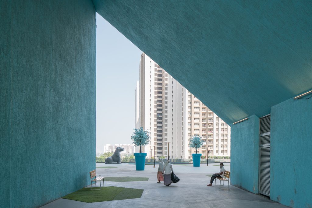
The courtyards below are linked by four-storey-high triangular gates, creating a 500-metre-long walk, and also feature different uses, with some designated for play, and others for sport, garden spaces, and more. This impressive list of amenities was made possible by the scale of the development: With so many apartments in one project, luxury features such as a 50-metre lap pool only add a fraction to the overall cost.
While much of MVRDV’s approach focused on rethinking Indian housing, the design also recognises which features should carry over from typical housing developments. A simple yet effective natural ventilation system, which both cools the apartments and can help extract air from kitchens, helps to make personal air conditioning units optional for residents. The floor plans also incorporate the principles of Vastu Shastra, the traditional system of architecture (often described as India’s answer to Feng Shui) that has long been expected of new developments in India.
The completed building is just the first phase of the larger Future Towers project at Amanora Park Town, which comprises three phases and around 3500 dwellings in total. MVRDV is currently working on the second phase of the project.
Though “context-sensitive”, “diverse”, and “community-focused” may not be the first terms that come to mind when imagining a building that houses over 5,000 people, MVRDV’s Future Towers is an attempt to upend those perceptions. It is a building that understands the demands of Indian housing and the expectations of Indian culture, and uses the context of a brand new township to reimagine how they can be combined in a way that is better for both residents and cities at large.
Photos: Ossip van Duivenbode
Cebu Macatan Airport, The Philippines by Integrated Design Associates and Budji Royal
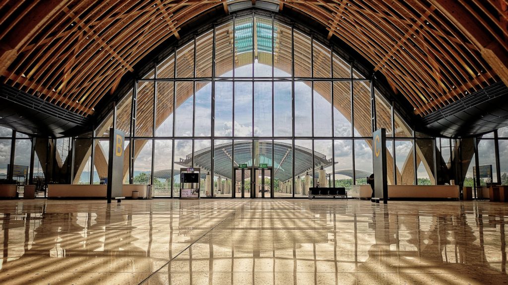
Mactan Cebu International Airport takes its inspiration from rolling waves. The undulating timber roof of this airport on the island of Cebu was designed by Hong Kong-based Integrated Design Associates in collaboration with local architects Budji+Royal and furniture designer Kenneth Cobonpue as a “symbolic gateway to the Philippines”.
Located in Lapu-Lapu City in the island’s main urban centre of Metro Cebu, the terminal building is expected to handle up to 12.5 million travellers annually, including tourists visiting the Visayan islands and the Philippines’ other resort destinations.
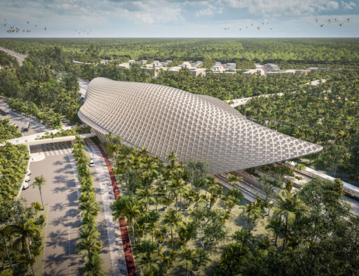
The design showcases many contextual elements which feature a striking external form comprised of several arches topped with an undulating metal roof that is intended to recall the shimmering surface of the surrounding ocean.
The large arches that each span around 30 metres are made from glue-laminated timber and are joined by thousands of smaller wooden ribs to form a skeletal structure.
This framework reduces the number of columns required and creates a largely open internal volume, which is filled with natural daylight by glazed sections at either end and by skylights running along the apexes of the roofs.
The use of exposed timber throughout the space is intended to contribute to a welcoming atmosphere that the project team describes as mimicking “the Filipinos’ well-known warmth and hospitality”.
Photos: Pitch Photography

