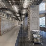
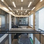
Shanghai-based practice AIM Architecture, founded by Wendy Saunders and Vincent de Graaf, has designed the new retail store and warehouse for Chinese apothecary brand Harmay located in the Chaoyang district in Beijing. The new 650m² warehouse is spread out over two floors. The architects hacked out a part of the high ceiling to create a gaping void for volume and visibility. Main materials used are brick, concrete and metal mesh screens which enhance the rawness of its industrial theme.
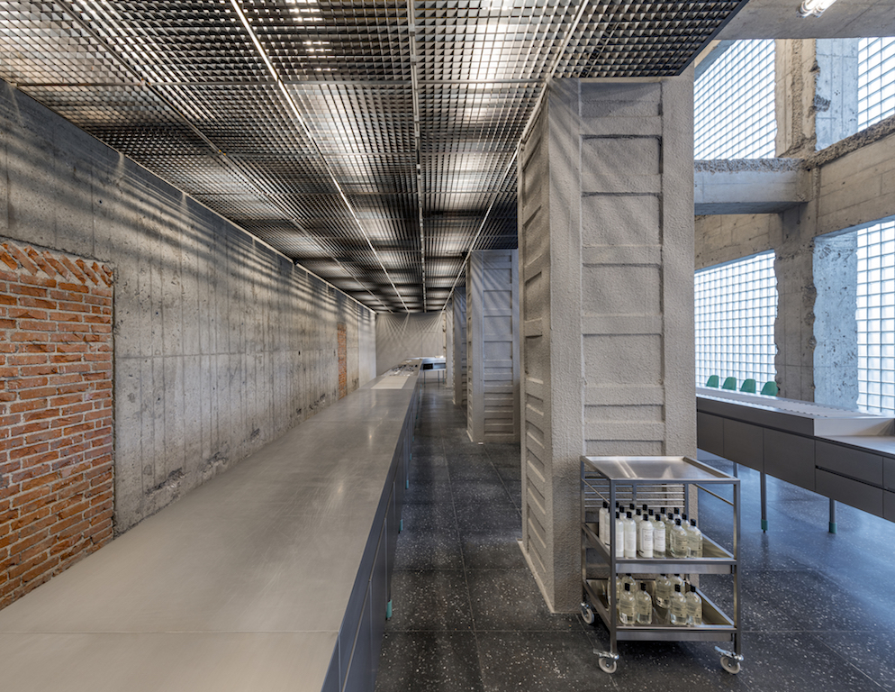
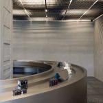
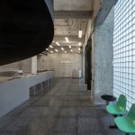
The first floor focuses on small products, where a huge assembly table creates strong movement and functions as a carrier where all the fast-moving items, are showcased. Spatially, the big loop creates a unified space, tying all the products together more cohesively, while enabling a semi-enclosed area for the staff to work.
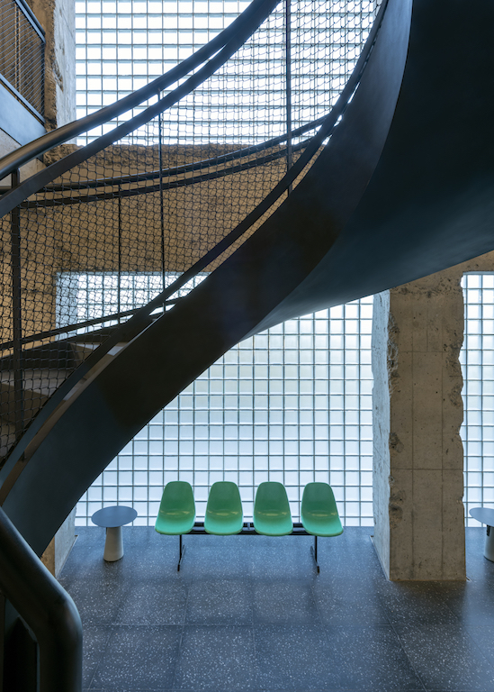
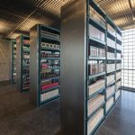
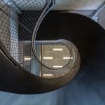
A spiral industrial staircase swirls up from the assembly table and guides guests up to the larger part of the warehouse space, where rows of steel shelves housing a multitude of products greet visitors. The second floor also grants a peek behind the curtain of Harmay’s branding machine. A curtain closes off the light filtering through a translucent facade, creating a small studio for product shoots.
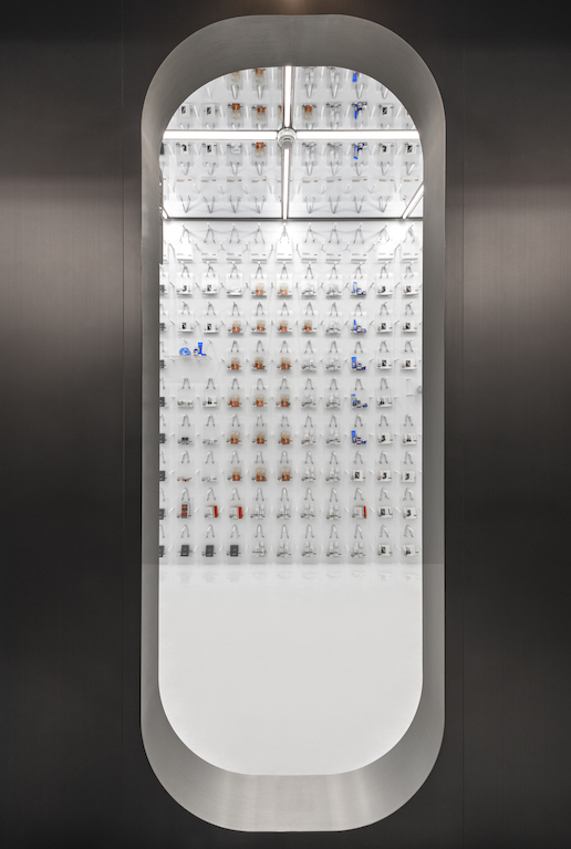
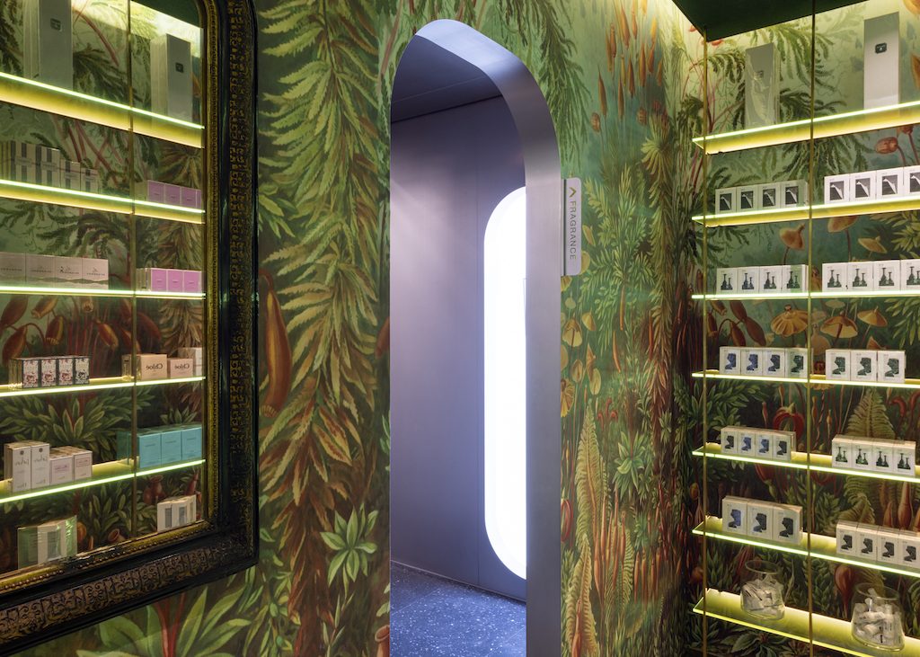
Here you can also step into five rooms designed to enhance the offline sales engagement. Each room offers a themed product focus. A white travel kit room features see-through bags filled with smaller products ideal for travel. The product is displayed with efficiency and elegance: hanging from the wall and centered on grab n’ go concpet. The perfume bar has colourful flower patterned walls, and is a romantic tribute to the lasting power of scent.
A third room invites visitors to try on products behind soft curtain walls. Like a backstage dressing room, there is a sense of fun, play, and luxury. The niche room is a high profile room tailored for exclusivity, luxury cosmetics, and brands unique to Harmay. The fifth room is white, a blank space, like a crisp sheet of white paper, where guests are invited to reinterpret the space.
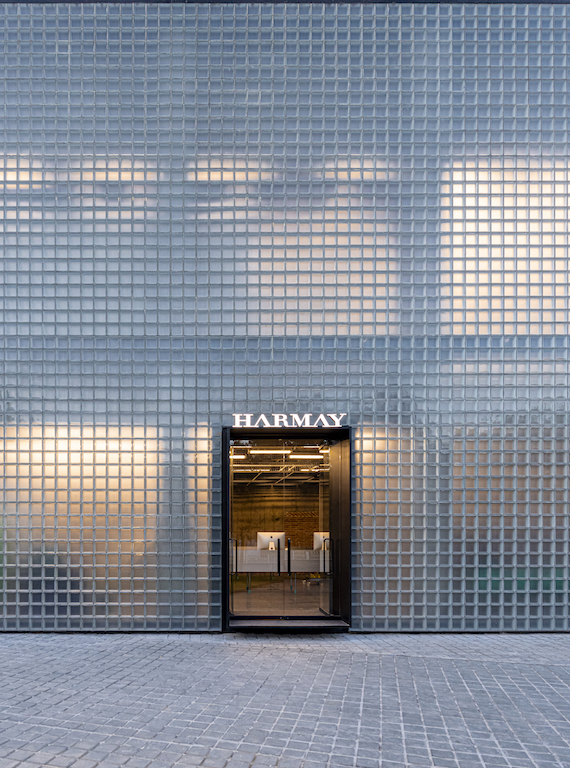
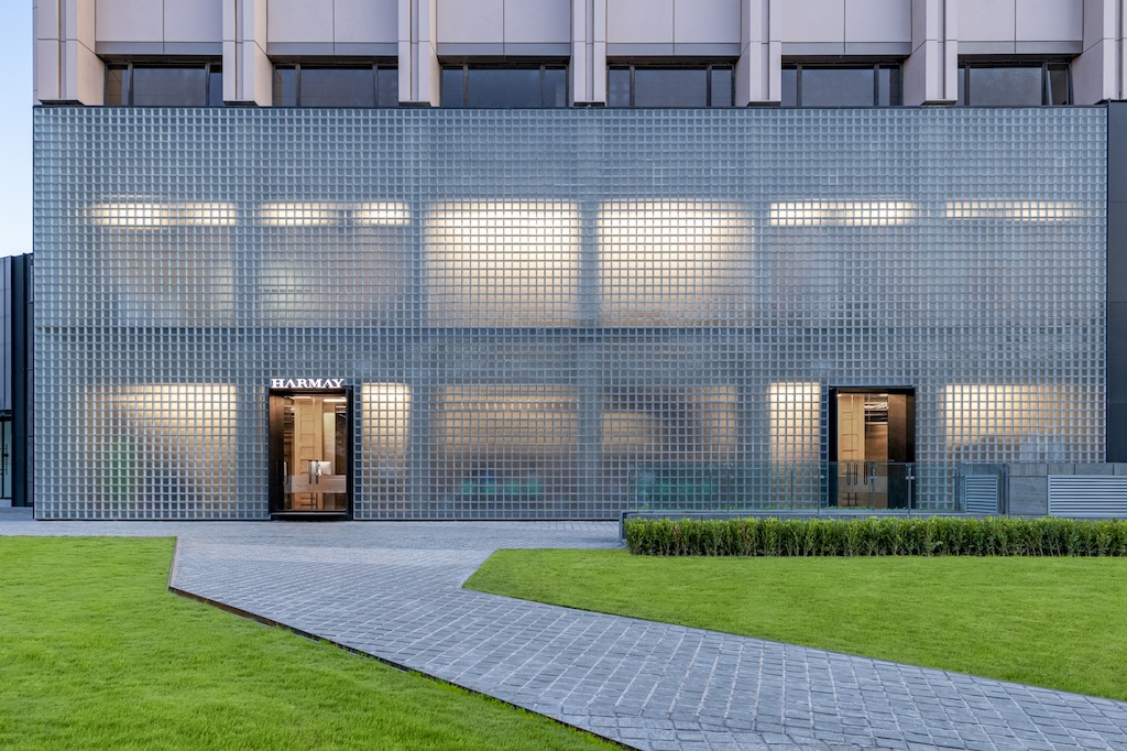
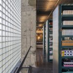
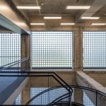
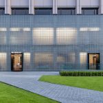
The Beijing location has a big glass brick façade, an industrial statement where the absence of seeing makes the exterior statement more powerful, by the interplay of shadows and movement.
Photos: Dirk Weiblen

