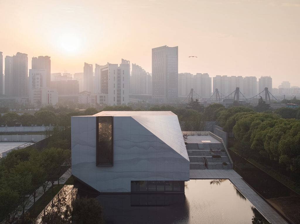
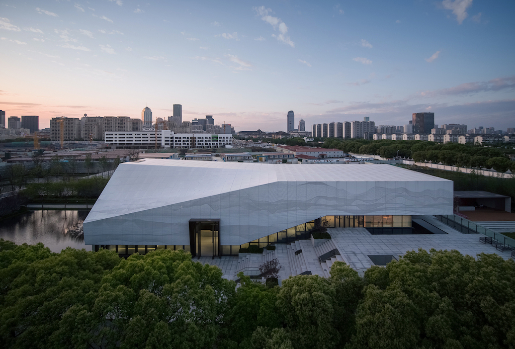
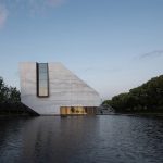
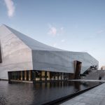
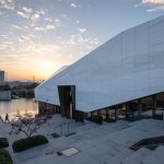
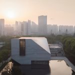
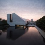
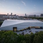
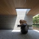
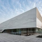
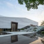
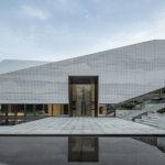
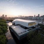
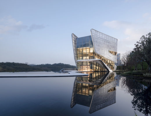
Located in Suzhou, a city known for its canals, the cultural centre by Lacime Architects, led by Zhaoqing Song, and assisted by Dan Guo, Jichang Nie, and Minqi Wu, aims to explore the local cultural form and language and stimulate the vitality of surrounding open spaces and make it a gathering point for residents.
The 2,078m² project is located in the city centre next to Suzhou Canal, where there is a grand canal view in the distance and urban trunk road in close proximity. As a city rich in historical and cultural heritage, Suzhou is widely known as the “garden city”. Taihu stone is an essential element of the garden, and it represents an important cultural carrier much loved by citizens.
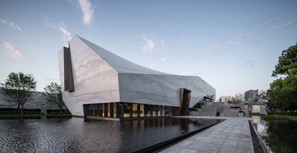
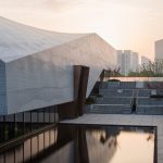
The project attempts to establish the connection between the Taihu stone and the front structure. Based on this, a modern balanced Taihu stone with metaphorical meaning is created in a twisted, bevel, and split form. The past and present forms are overlapped to transcend time and space, which allows visitors to experience the space through time – both past and future.
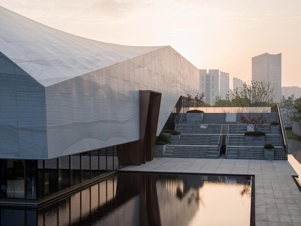
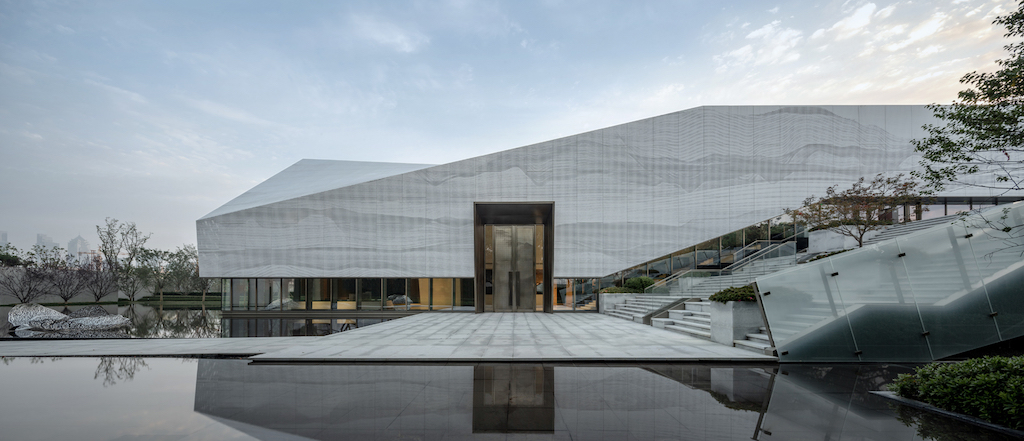
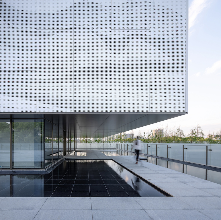
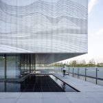
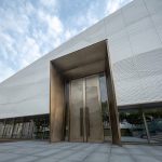
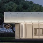
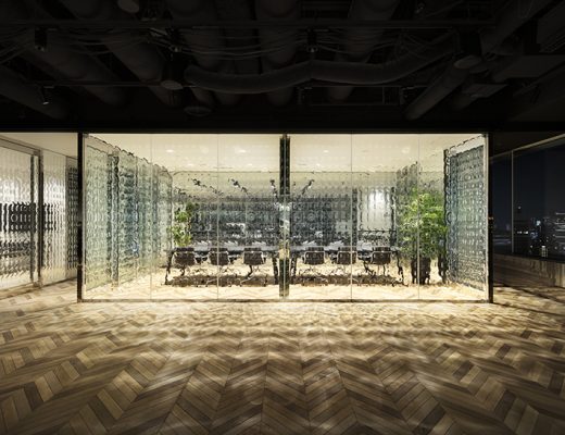
The third interface is added beyond the structure and glass curtain wall so that viewers can’t see through internal space, which blurs the distinction between internal and external spaces. The outer skin system, glass curtain wall system, and column system are separated in proper order, and they look somewhat different but get overlapped visually. Such ambiguity results in a more restrained yet impactful experience.
You might also like:
Neri&Hu transforms former drab sales office into Junshan Cultural Center in Beijing
Zaha Hadid Architects designs a new cultural complex in China’s Changsha city
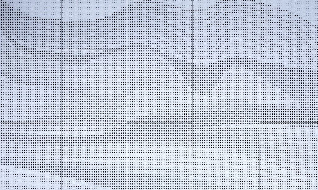
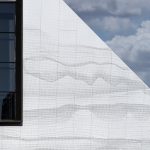
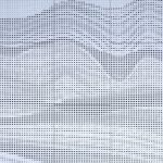
For the second-layer facade design, the architects used parametric skin texture that creates a poetic picture of Suzhou by lines. The abstract binary pattern goes through time and space in an attempt to give viewers non-figurative graphical information that is open to visitors’ interpretation. The landscaping in the project creates opportunities to explore Suzhou’s personality in a modern approach – through sharp but simple geometry and flowing lines.
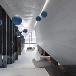
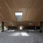
The design team strives to achieve unity of structure, space, and form throughout the project. The main space is a flowing space with a column-free steel structure, and the roof is presented in a twisted form. Sunlight streams through the sides, and outdoor large steps lead to indoor space. They constitute an endless loop and get interwoven to blend in with the building form.
To bring simplicity to space, the design team adopted the design combining steel structure and curtain wall, and that means the load-bearing system of the curtain wall becomes the structural system. More upright columns are used without beam-columns to form an unobstructed structure.
See the full image gallery here:
Photos: Schran Images


