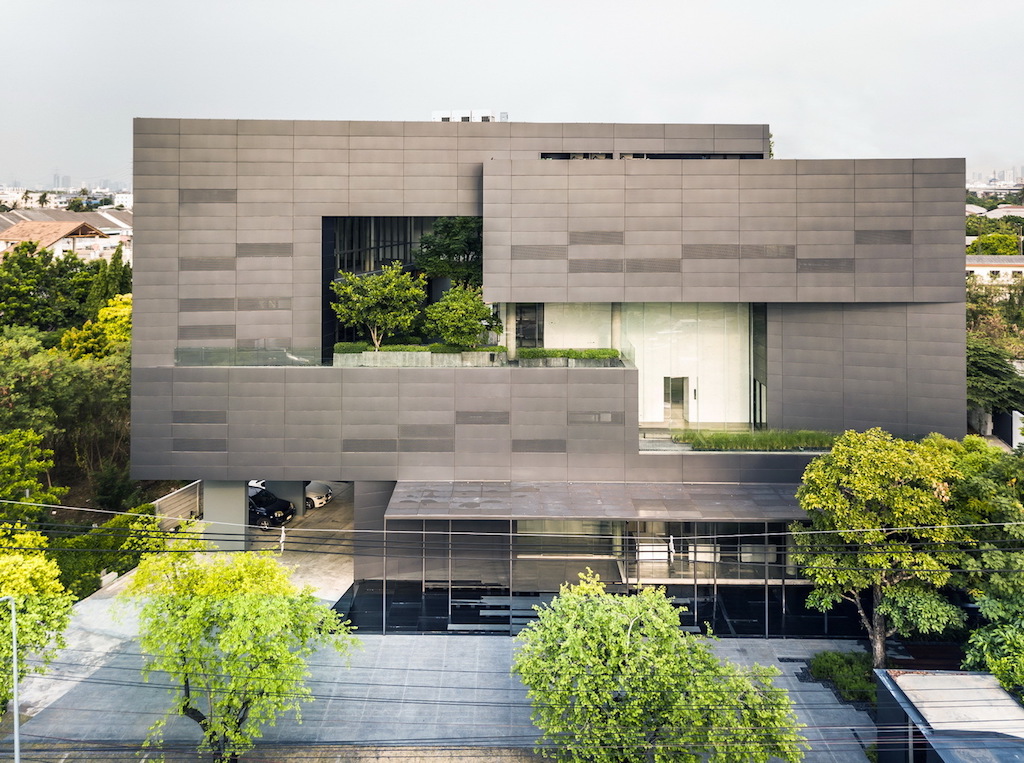
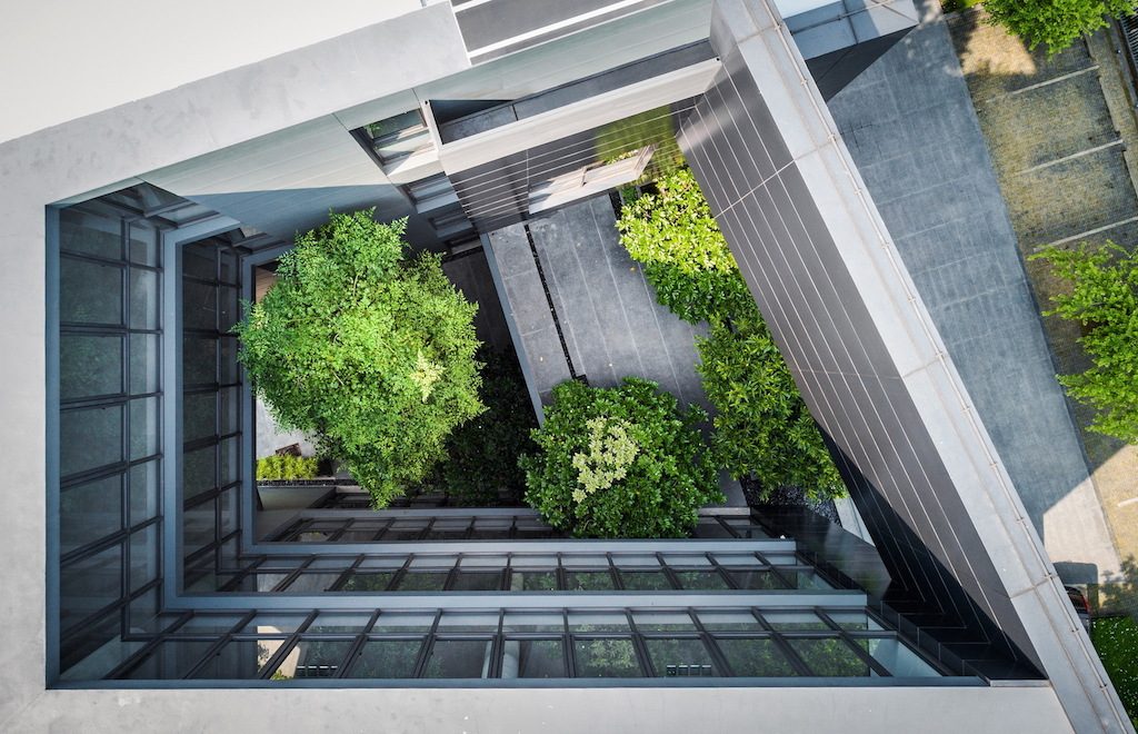
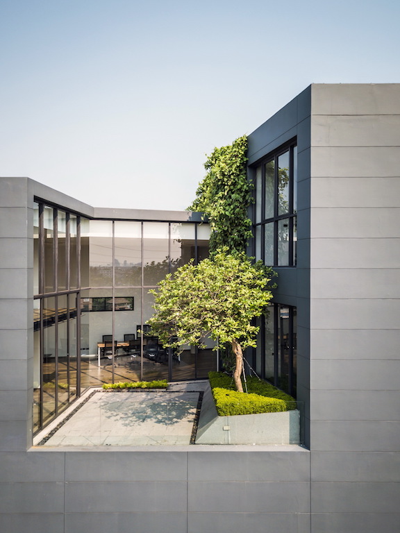
Designed by Bangkok-based architectural practice Stu/D/O, and led by architect Chanasit Cholasuek, the headquarters of the MacroCare, an audio-visual and system integrator manufacturer, reflects its motto of ‘Trusted Connection’. The interlocking masses and the tilting planes form a large void within the centre of the 2,000m² building that not only becomes a green space but draws the eye towards this large open space where social connection and interaction occur within the company. 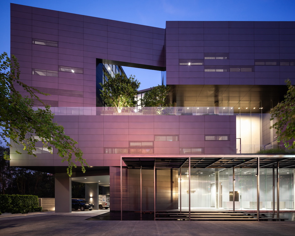 While cutting away or subtracting from the large mass to create a void within the very centre, this internal court is where visual connection within the different functions occur as each programme space looks out into this large outdoor atrium, giving cohesion to the different departments that make up MacroCare office.
With the site being west facing, the front façade of the building had to be closed to block the harsh sun rays, therefore aluminium panels were designed to clad the entirety of the mass not only to give the building a modern impression, but its perforations and openings work to create self-shading and ventilation for the building. 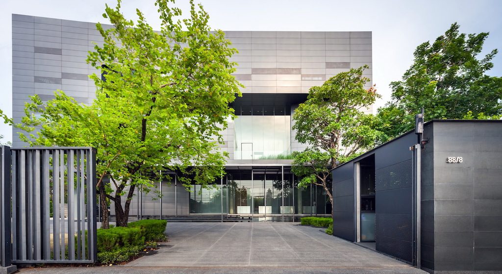
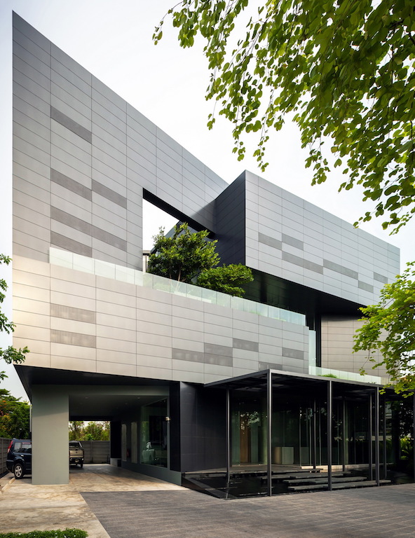 The angular turns interlock the mass to create an open void within the middle of this largely dense mass. This central void enables some greenery and nature to exist within the various programs as they face inwards towards this internal court that allows light and air to filter through, providing an open-air space in the heart of the building.
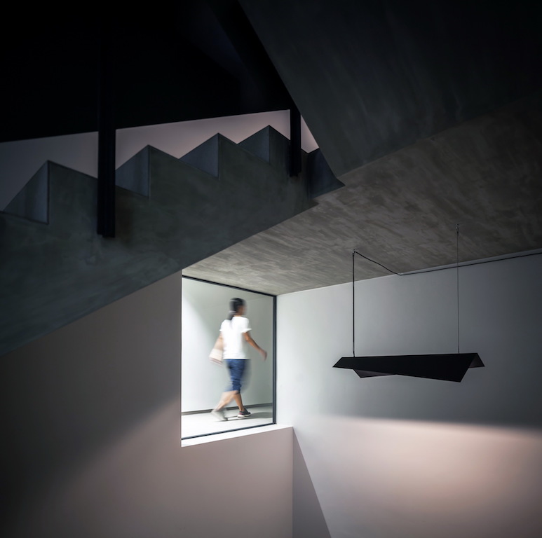
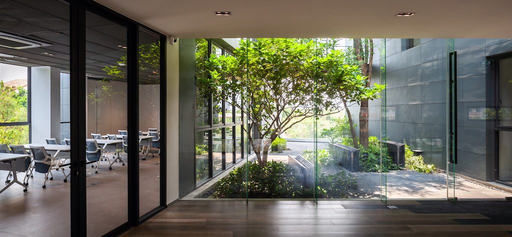 Other green pockets are added within the building, such as small courtyards on the second and fourth floors that connect to the Gallery, Innovative Space and Workshop area, with the aim of giving a better quality of work-life for the employees and main users of the building.
The design of the approach and entrance of the building includes a reflection pond that uses the same pattern as the façade panels but shift and tilt slightly to create subtle effects when the water and light filter through. 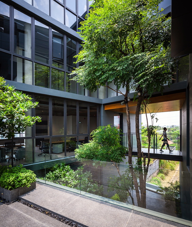
The narrow bridge crossing the reflection pond, along with the randomly arranged columns on the deck that mimic tree trunks within the forest and perforated pattern canopy that filters subtle light through gives the entrance an ambiance that resembles nature, but in very distinctly modern materials and environment. In the evening, the perforated pattern canopy cast shadows onto showroom, creating a digital translation of the natural tree canopy; a feature experience for the visitors of the company.
Photos: Spaceshift Studio
