Interior architecture practice LW Design’s Dubai team has completed the interior scheme for the new Raffles Hotel in Shenzhen, China. Raffles, One Shenzhen Bay, which features 168 spacious guestrooms and suites, occupies the top floors of an 80-storey tower designed by American architecture firm, Kohn Pedersen Fox, in the One Shenzhen Bay development. 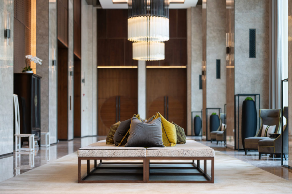
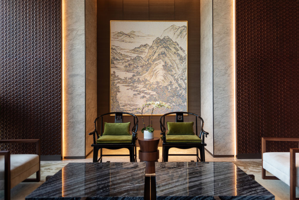 The LW Design team, headed up by award-winning designer Pia Sen, was tasked with creating a contemporary interior that pays tribute to the Chinese culture in which it is set. The strong connection between the spectacular views over the bay and the hotel’s interiors has been carefully planned. Sen says that the design team was challenged to work around the views, and to integrate them into the design rather than block them out. DE51GN speaks to Sen about the project:
DE51GN: How did the project come about? Did you pitch for it along with other contenders?
Pia Sen (PS): I’m proud to have been part of the journey of completing their first hotel in Asia. After working on the Raffles hotel in Dubai, this was the ultimate next step. 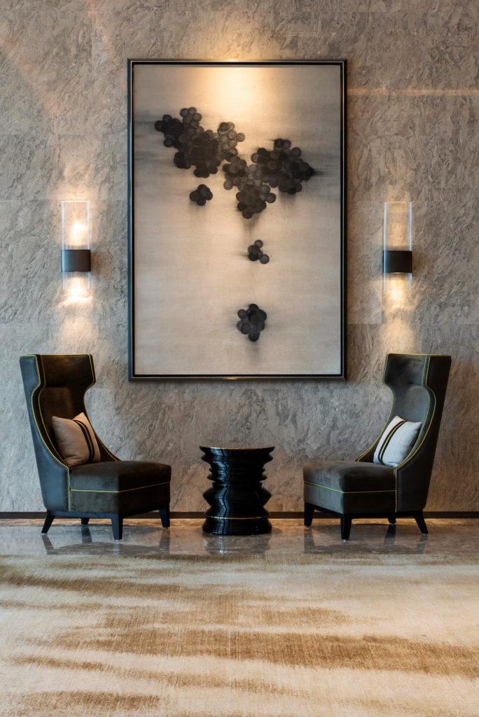 DE51GN: Raffles brand name has a DNA steeped in heritage. How did you marry contemporary influences with a storied name?
PS: For this project, we had to preserve a balance between modern and contemporary Chinese culture, which doesn’t seem like a difficult task, but there were so many other factors to consider. We also had to seamlessly embody the Raffles brand into the design.
As you can understand, this wasn’t an easy feat to accomplish in a high-rise tower, especially if it’s based in a city that stands as a commercial hub of the world.
But the beautiful surrounding landscape assisted us. It helped us develop a distinct concept that involved analysis and exploration. Not to mention, this was a multi-use building, so designing it to radiate a distinct residential elegance was design praxis many designers have only read about. 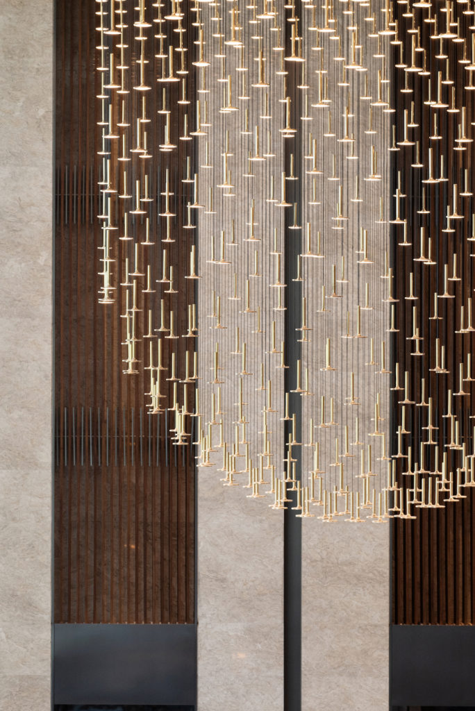 DE51GN: What were some of the unique challenges of working on this project?
PS: I would say that the biggest one would be the language barrier. I felt that a lot of things got lost in translation, so it was rather difficult to present our design vision.
As regards the work culture: I do not really think that the work culture is that different from the Middle East. There is a real hierarchy within the offices and you have to always wait for the top person’s approval before proceeding, which can be time-consuming at times, but this also happens in the Middle East. I will say though that things are a lot more formal in Asia. We are also used to working all hours if needed, but I found that come lunchtime (between 12 to 2pm) it was impossible to get any work done, as they all take a nap in the office during this time. It was quite weird to see how they all had pull out drawers with integrated mattresses in them, so that they could sleep during their lunch break!
DE51GN: How would you describe the hotel to a friend who has never been to China?
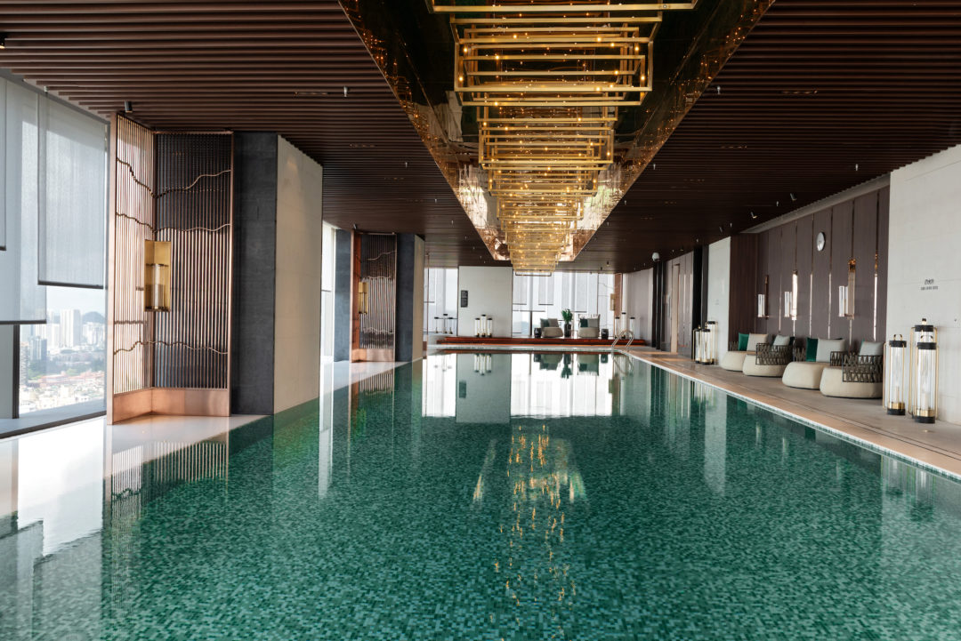
PS: Personally, I’m particularly proud of the spa; our persistent analysis, research, and evaluation into different wellness complexes and relaxation centers provided an excellent outcome. An integral part of designing the interior was creating the spa, which we think exudes an intimate and luxurious air. Its bespoke colour palette, lighting, and décor set it apart as a benchmark for spas of the future. Because of this, guests and visitors will find that the expanse has a luxurious and residential feel to it. We wanted to restore a peaceful ambience that projects what all visitors and guests would want for a comfortable stay. Since we had captivating scenery to start with, the design team used it as a source of direction for the project’s ultimate result is a space that integrates nature with modern existence.
The unspoken goal remained the same throughout different stages: it was important that we create a strong residential atmosphere with the highest levels of luxury, exclusivity, and intimacy paired with every modern-day convenience a hotel has to offer.
We were heavily influenced by the natural surrounding landscape, traditional Chinese culture and the specific history of the Shenzhen region. Thus, concept development was a journey of exploration and analysis. We studied different kinds of imagery, patterns, and motifs, with a particular emphasis on colors that reflect the hues of the surrounding water and mountainscape beyond.
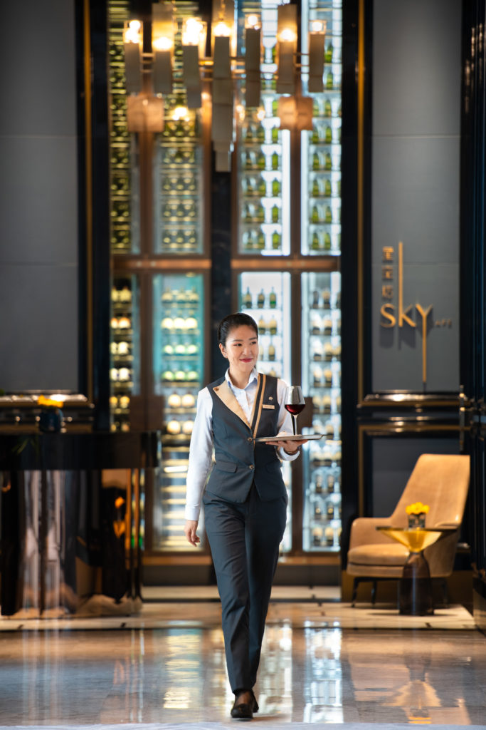
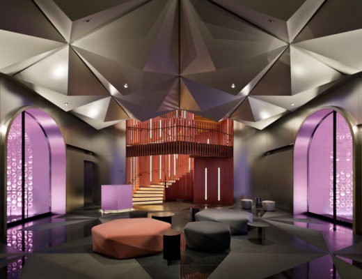
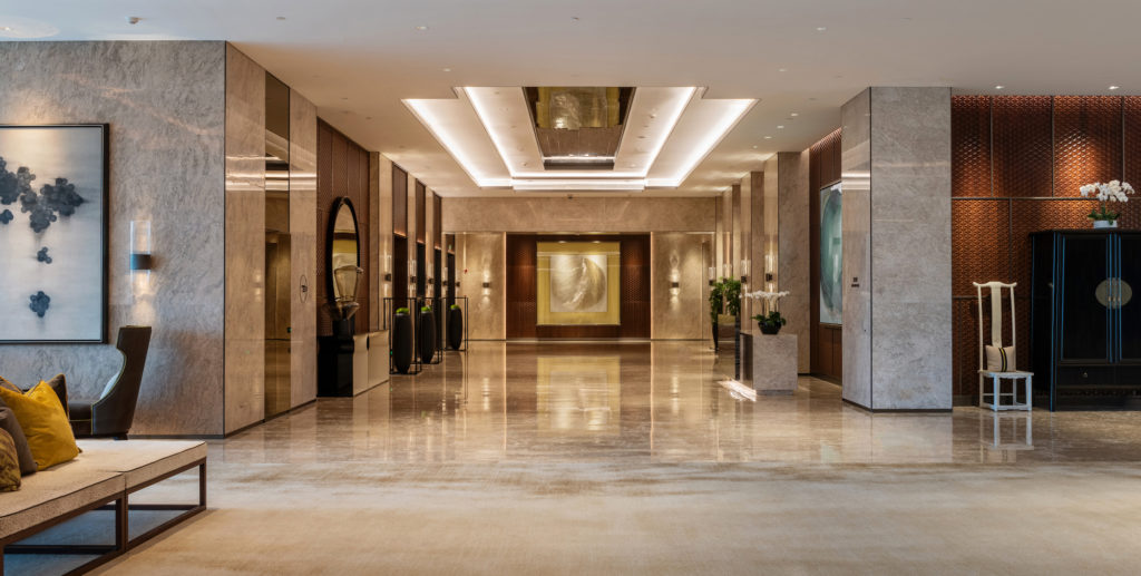
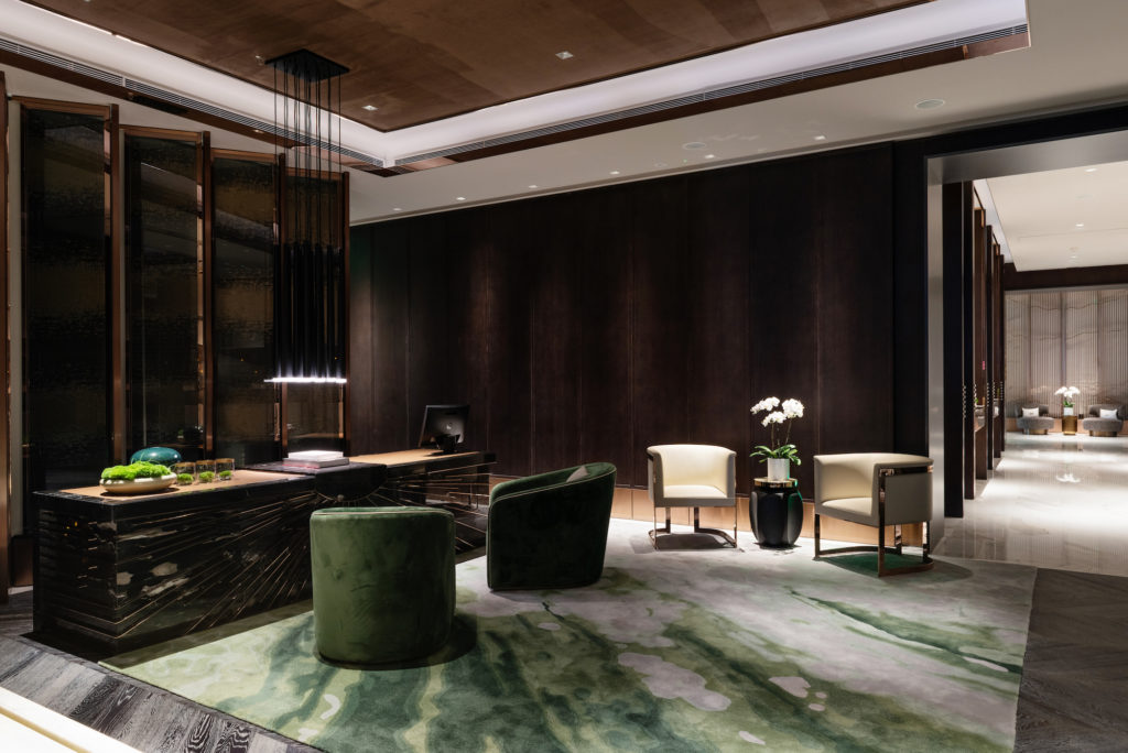
An evident aspect throughout the design is the connection between interior spaces and the spectacular views out over the bay. Everywhere you look the panoramas dominate. 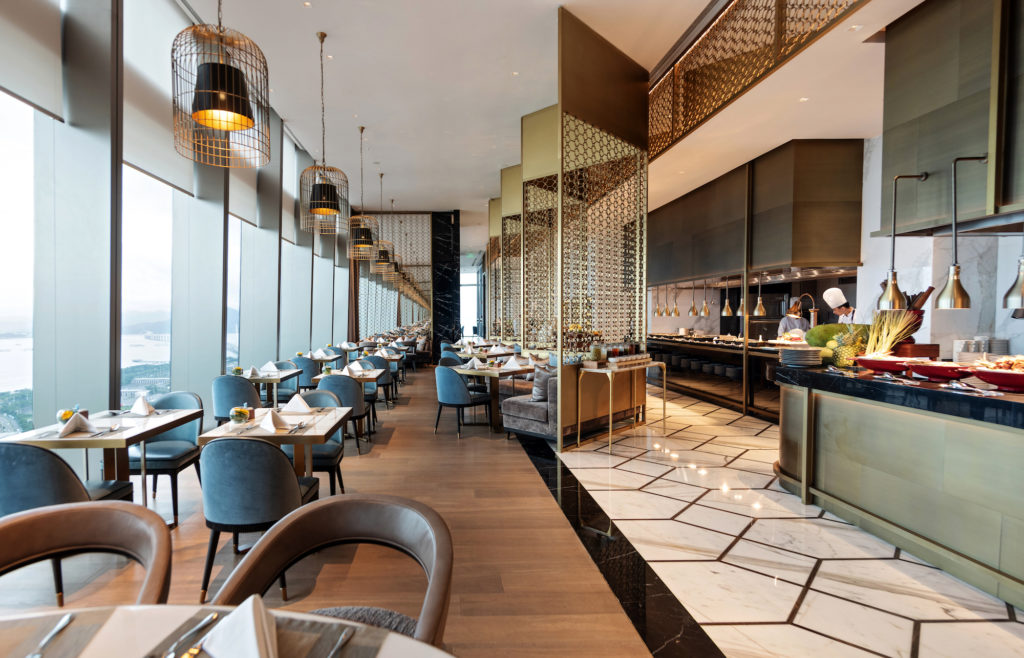 Visitors are transported from the double volume ground floor entrance straight up to the Sky Lobby on the 34th floor, against the backdrop of the Pearl River Delta. Materials used to create the look include warm timber, decadent marble and metal details, paired with softer accents.
 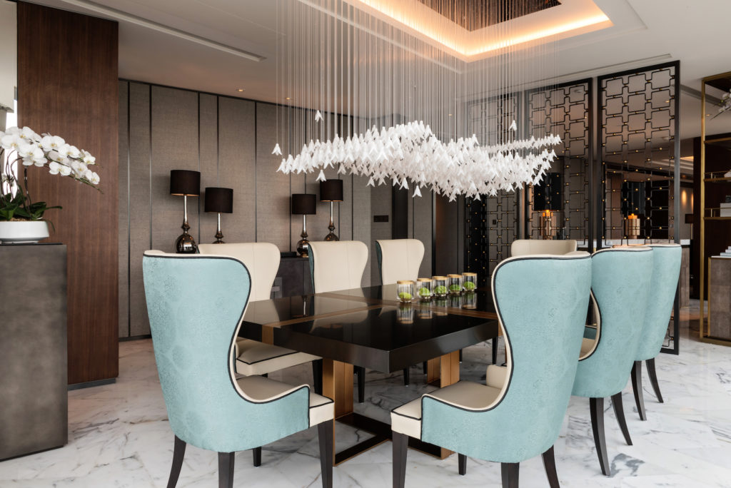 On the banquet floor, recessed high ceilings cleverly disguise lighting that sets a perfect scene for the flexible event spaces. The 168 rooms and suites, inclusive of a 465sqm Presidential Suite, are accessed by corridors that showcase interesting artefacts. Once inside the rooms, the interiors are based on neutral shades, with pops of nature-inspired colour featured in the loose rugs, cushions and quilts. The eye is drawn to the silkscreen wall panels that adorn the walls. Again, traditional cultural elements are introduced through select furniture pieces, and the distinctive Raffles ‘library’ is present in every room. The Presidential Suite, the height of welcoming luxury, is decorated with warm amber shades complimented by rich metals and plush fabrics.
  Setting a new standard for spas within the Raffles group, the design of this multi-purpose space is striking. The spa is divided into distinct zones for quiet and active pursuits, defined by changes to the colour scheme from dark to lighter. Bronze, warm tones, herringbone-patterned oak floors and varying wall coverings work together to make a homely environment, albeit a very opulent one. Loose watermark rugs, candles and soft cushions in lucky shades of green support the residential feel. “The spa has an unusual, unexpected ambience of a luxury home. A place to truly immerse in relaxation,” Sen explains when describing level 33. The spa includes a reception area; six treatment rooms; changing rooms complete with saunas and steam rooms; a gym and a magnificent indoor infinity pool that looks out over the bay.
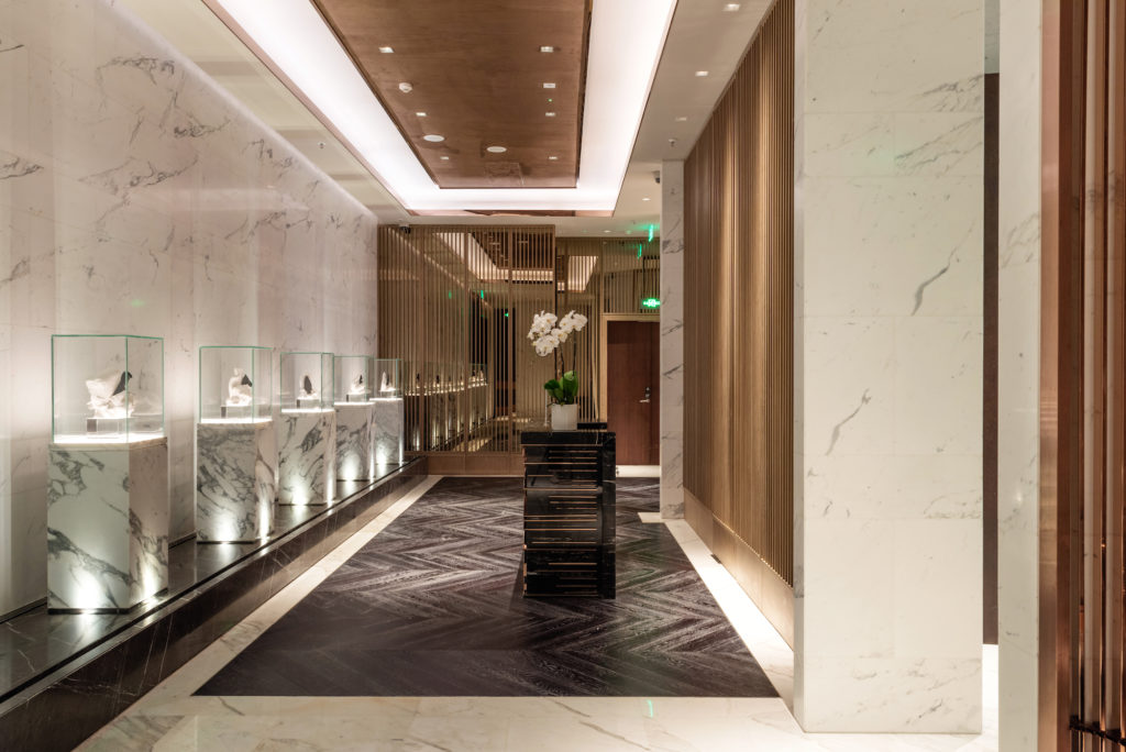 Raffles, One Shenzhen Bay, operates four in-house F&B outlets. On the ground floor, a cake shop has been designed as a light, bright replica of a bespoke jewellery store, down to the glass display cases and amethyst-inspired lights.
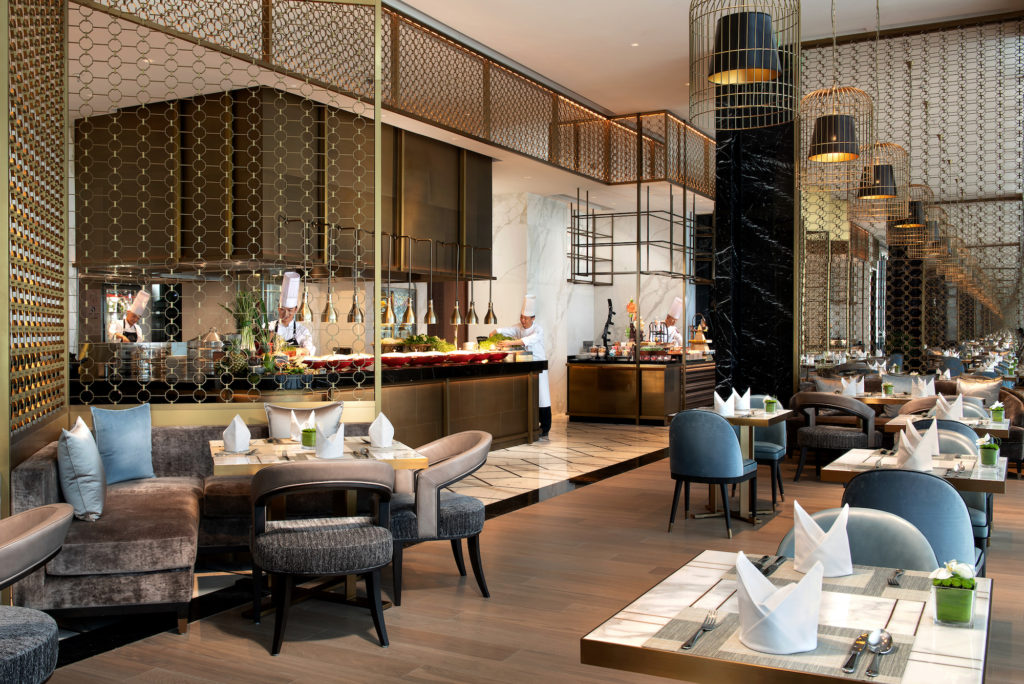
 Further up, on level 34, the Lobby leads into a 500sqm all-day dining restaurant that follows a more masculine Chinesoreie theme. Here, a black lacquered door with a duck egg blue shagreen inset creates an impressive entrance. Patterned white marble, inset handmade rugs and light timber planks adorn the floors of the venue where guests dine seated in sofas or comfortable chairs along the expansive window wall. Food counters are placed along the opposite wall to create an organic flow, while light bronze metal screens create the illusion of semi-privacy.
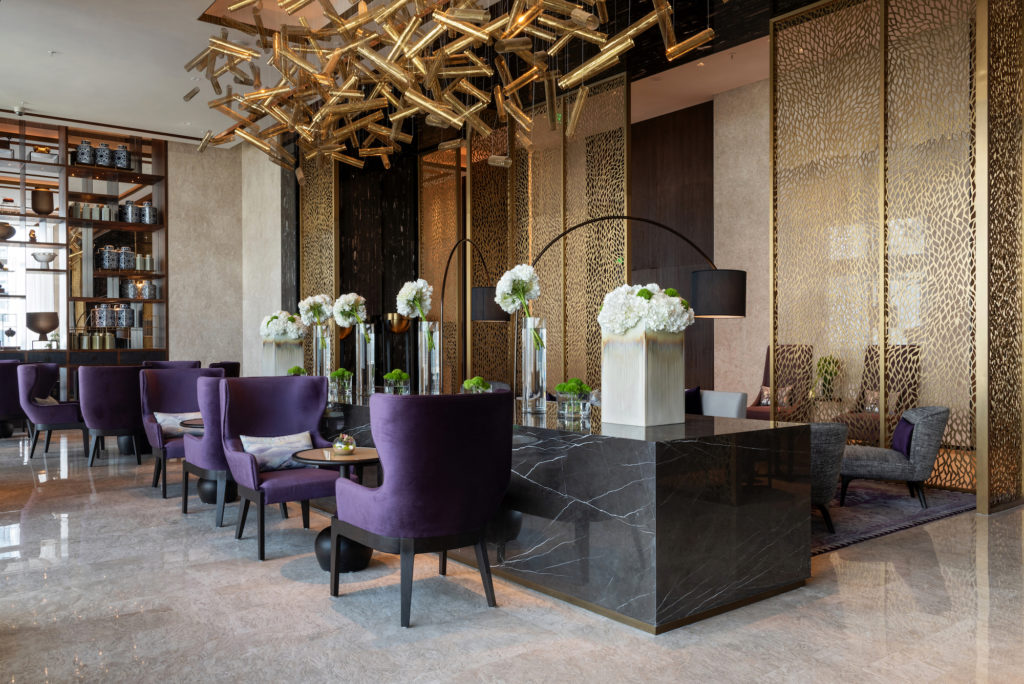
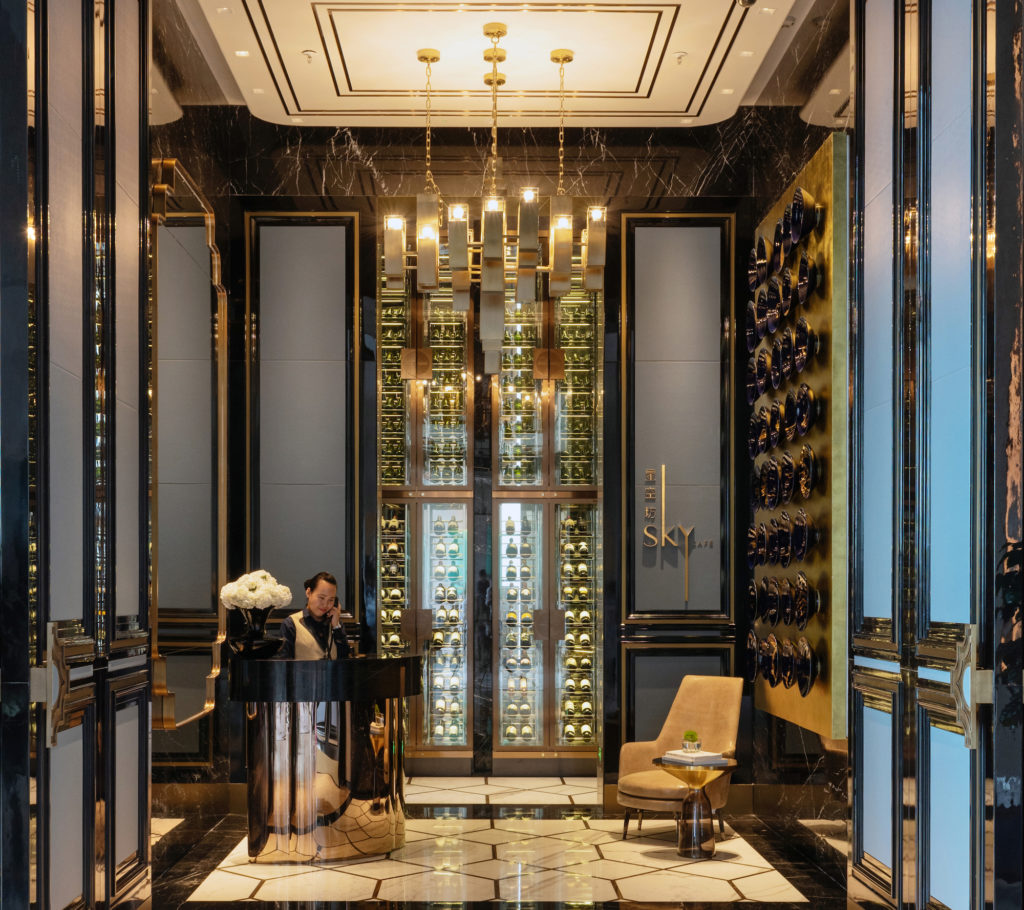 In the Japanese signature restaurant, the contemporary design uses dark materials, such as black marble floors and walls, black timber screens and rose-gold toned metalwork. Black marble counters run along the show kitchen wall, which is clad in rose-gold toned metal with an embossed cherry blossom motif. Along the window wall, guests are seated on black benches upholstered in a luxurious rust velvet, influenced by Japanese autumnal maple leaves. Floor to ceiling Sake display units, built in the style of Japanese Chidori toys, create a semi-private tasting room.
Photo credit: Natelee Cocks

