Jakarta-based Studio Kota Architecture, led by architect Erick Kristanto and assisted by architects Wendy Sudibyo, Farrel Prahaditya, has designed Tujuhari Coffee, a 150m² cafe and multi-purpose located in the southern part of the city. The brand promotes a productive and collaborative culture in its coffee shop by offering an open platform for any programmes related to work, art and culture in a social setting. People with different backgrounds, interests, and activities coexist in the same environment which drives social interaction.
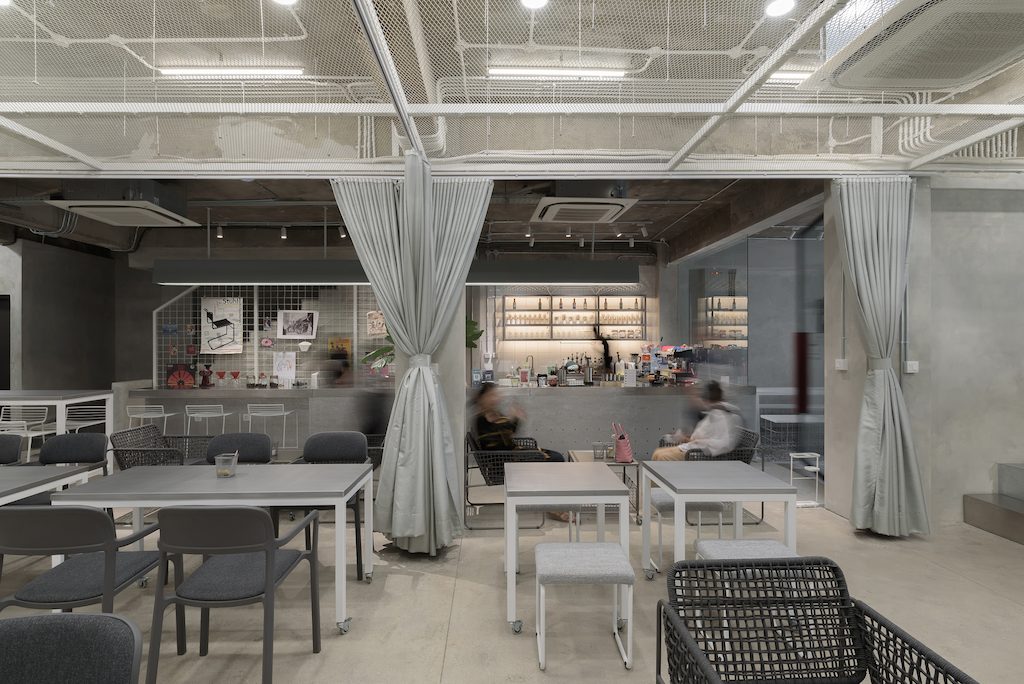
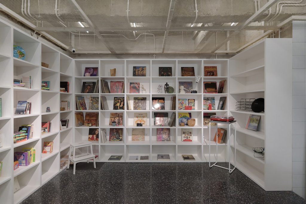
The productivity chamber offers a flexible and multi-orientation space for a different mix of programmes. This space consists of a mini amphitheatre, working space, artist feature wall, small performing stage, vinyl station and a bookshop. Various happenings from movie screening night, book launching, music party, startup pitch meeting, art exhibition, and charity event can take place in the productivity chamber. All furniture in the productivity chamber is lightweight, movable and stackable. With the mobility of the furniture, it is possible to see different seating arrangement every single day following the event happening that day.
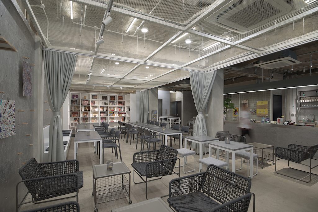
To provide a soft space divider for particular events, curtains have been installed to help compartmentalise the chamber to ease space management. An Expanded metal mesh drop ceiling is introduced in the productivity chamber to differentiate the space experience to the adjacent cafe chamber. The ceiling is also used to diffuse the light and to cover up the utilities.
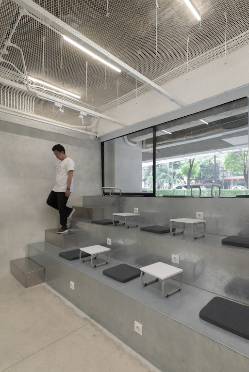
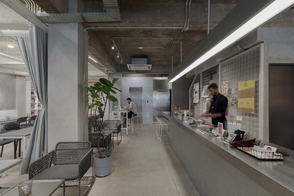
Materials chosen for the project fall into monochromatic colour spectrum. Practical and durable materials such as concrete, stainless steel, galvanised metal, and silver-painted wooden board is used to give a neutral and subtle tone. White ceramic tile and cement wall are also opted for to supplement the mood. Red color which is Tujuhari brand color is used to highlight some features on this project such as metal plate door handle and elevator wall.
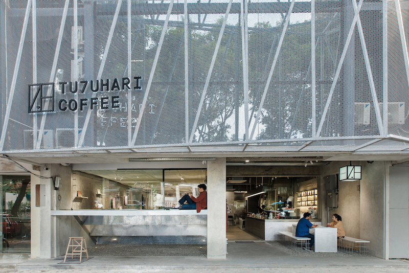
An exterior facelift is part of the design work. To wrap the existing shop house facade, permeable and lightweight material has been selected as additional secondary skin. Expanded metal mesh facade from the interior ceiling has been consistently used on the facade; the new skin acts as sun shading, which also gives a dematerialised effect on the building.
The folded geometry of the facade gives depth and texture on the building which makes it stand out from flat and monotonous row of typical shophouses. The structural steel braces coincidentally resemble the strong diagonal line from the Tujuhari logo. Another design strategy for the facade is to expose the interior features to be habitable parts of the exterior. The top part of the mini amphitheatre extends out of the facade and becomes outdoor seating for the customer; pushed back shopfront gives space for outdoor co-working area and the clerestory window gives a glimpse into what is happening in the productivity chamber.
Photos: Peter Sutedja, Kafin Noe’man Studio
