DE51GN speaks to Asmaa Said (below left), associate director of Dubai-based and globally operating interior architecture firm Stickman Tribe, founded by Marcos Cain, about its new project in the Maldives for hotel operator Hilton’s Waldorf Astoria brand. The project comprises a few dining concepts as well as a spa, all located on the island of Ithaafushi in the Indian Ocean. 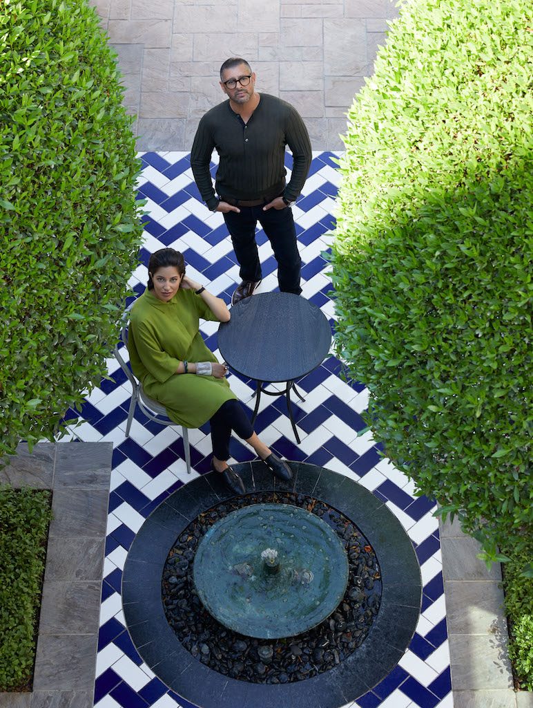
How did this project come about? Is it a new build?
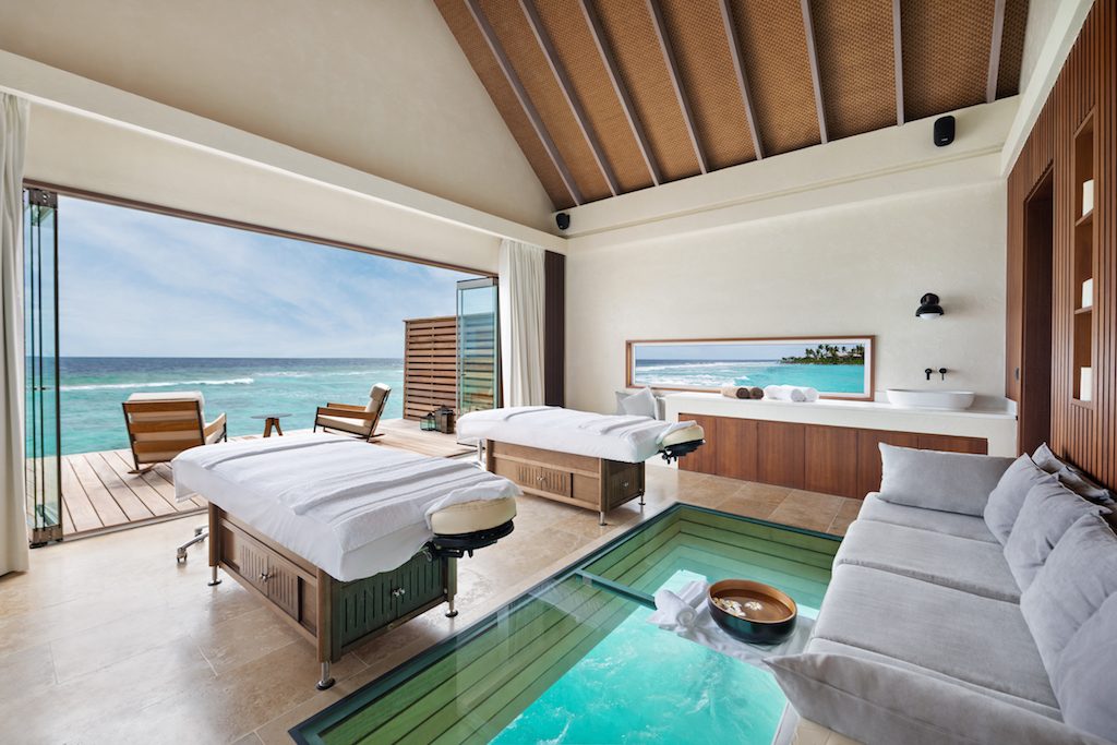
Asmaa Said (AS): The project is a new build. Stickman was approached by UCC (The Developer) in 2016 to work on three signature F&B outlets providing architecture and interior scope: Terra, Rock, and Glow. During the course of the project, the client extended Stickman’s scope to cover the interiors of the specialty Chinese restaurant, Li Long and the spa on the island.
What was the brief?
AS: There were very distinct briefs from Hilton (the operator) for each of the individual venues. Each restaurant was to be treated as standalone and to have a distinct identity from its neighbouring venue to truly provide a strong F&B offering within the island and Maldives.
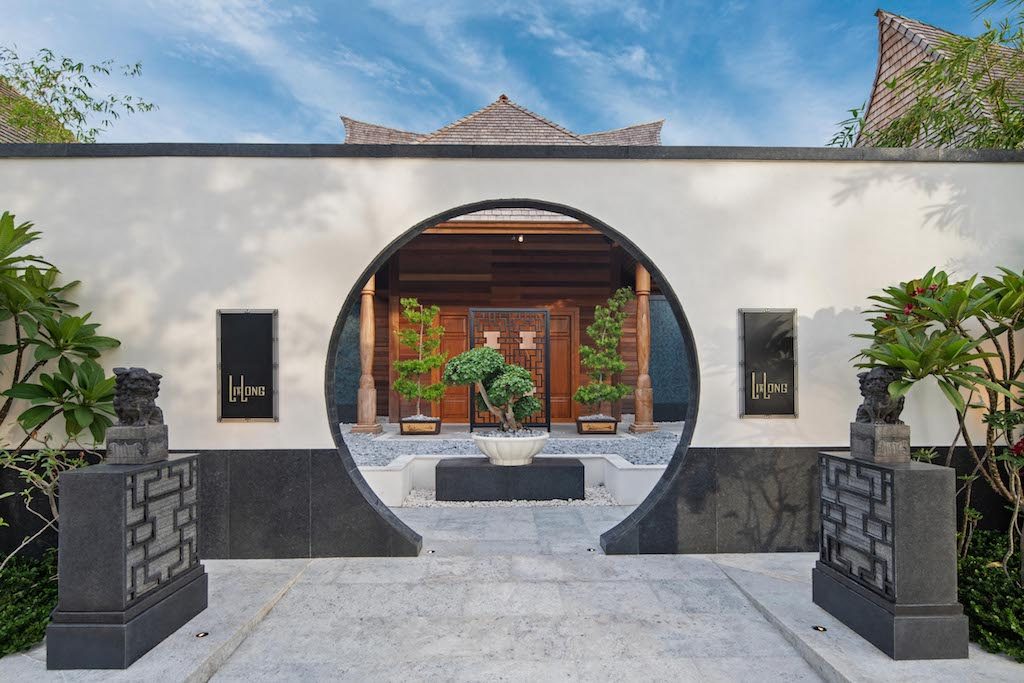
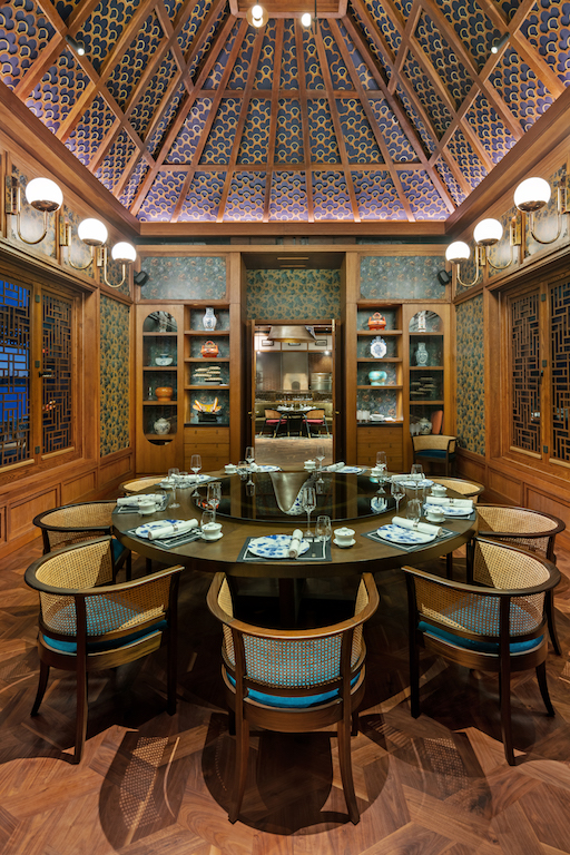
Inspired by the residences of Shanghainese noble families along the cloistered laneway, Li Long is perched on the turquoise waters of the picturesque Ithaafushi island. Intimate, charming and authentic, it is the signature Chinese restaurant on the island, featuring an impressive open kitchen, a foyer, dining room, private room & terrace. A delicate mix of warm and natural base palette with refined brass detailing and eclectic textiles create an effortlessly upscale and inviting atmosphere throughout. 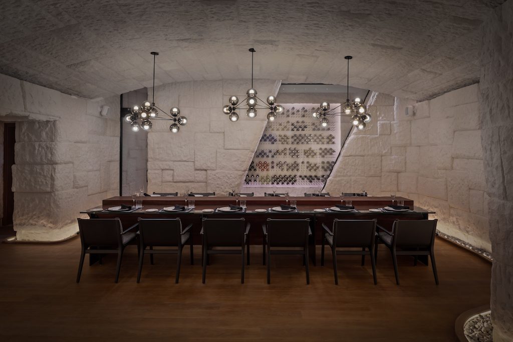
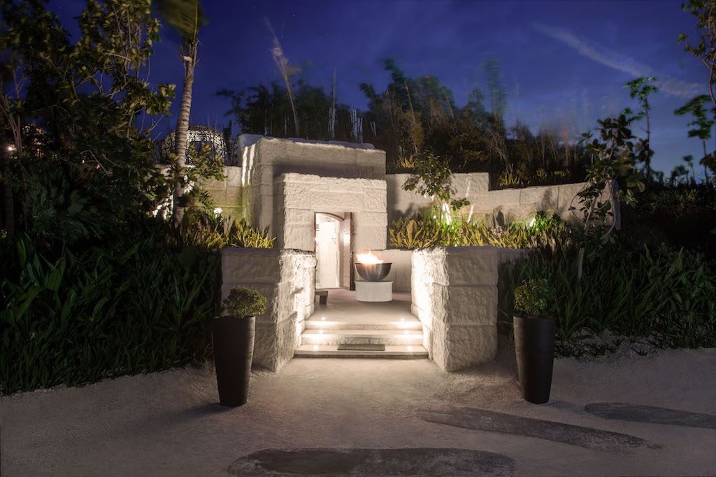
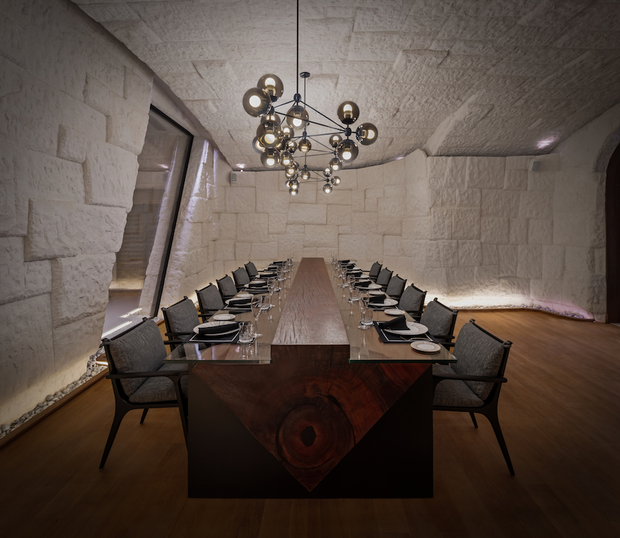
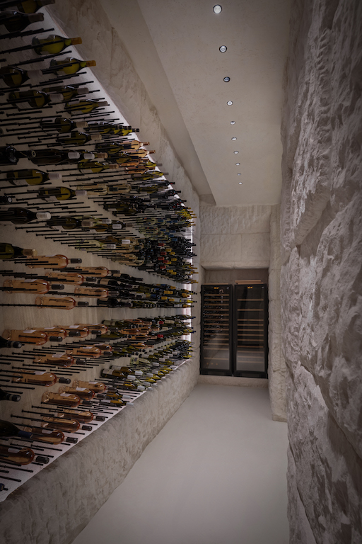
Staying true to the design brief, The Rock sits next to Terra camouflaged by overgrown moss, while the internal is a carved out wine cellar and dining experience, where a rustic environment meets a contemporary dining setup.
At the entrance, guests will only see the sunken seating where the pre-dinner drinks are hosted. One sitting per night for 12 people, the Rock will open up its doors with the sommelier greeting guests and welcoming them to the cave dining experience.
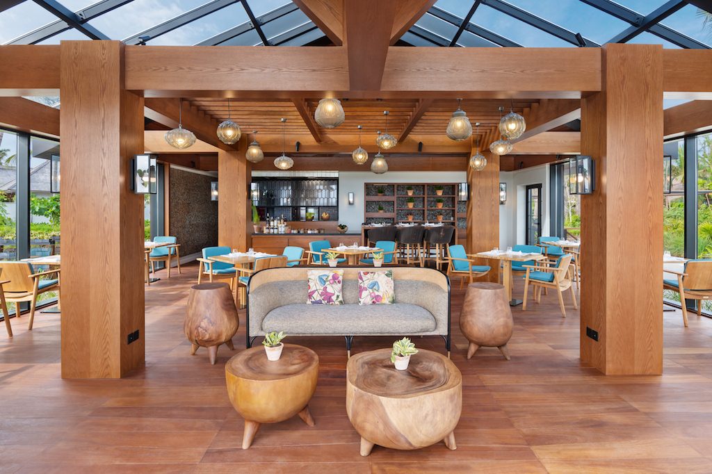
Glow, a hut-like structure shaded by greenery with modern contemporary lines to create a green dining experience with plenty of daylight during breakfast and the glittering stars in the evening. Located close to the spa, Glow is the organic kitchen of the island, a tranquil space where the fresh smell of herbs wafts through the air. 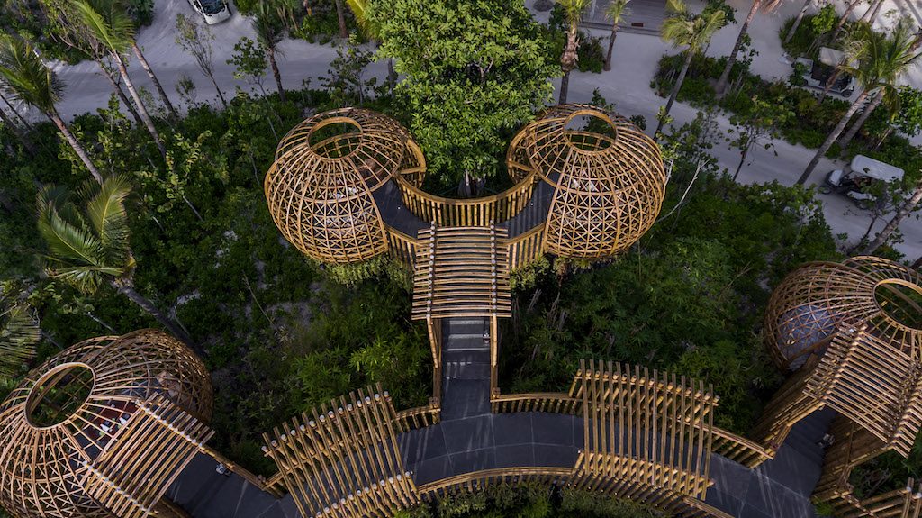
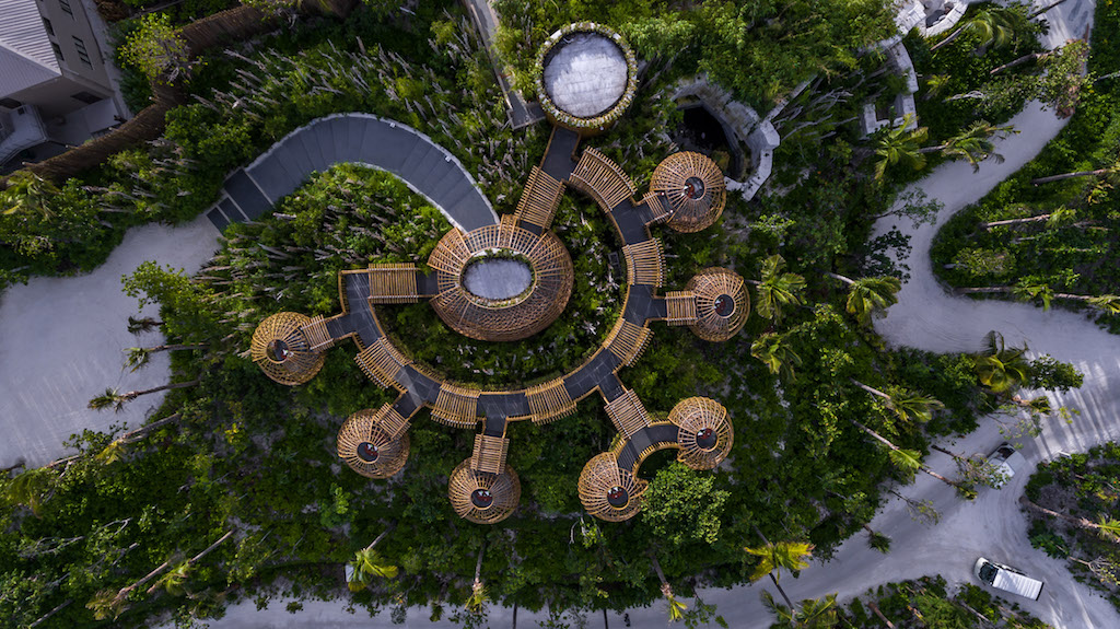
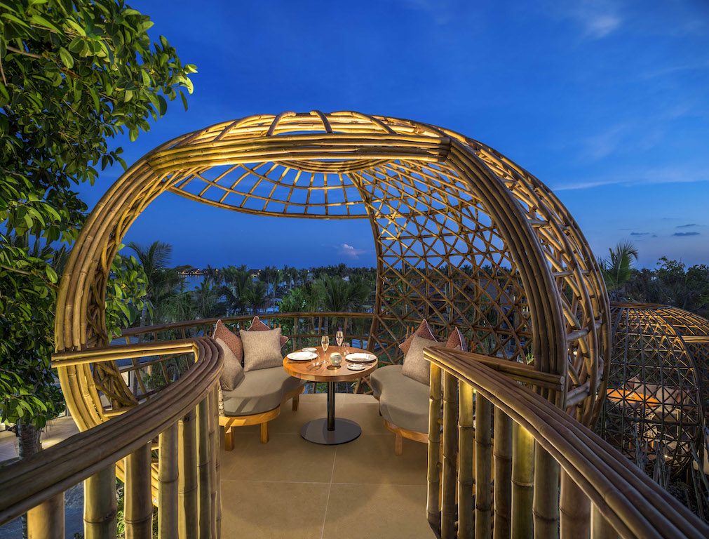
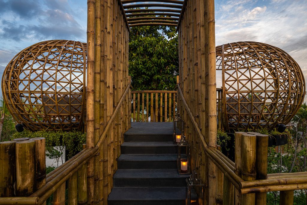
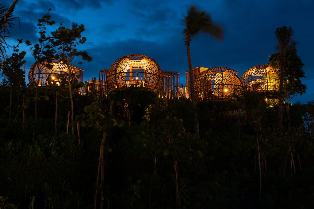
Inspired by a treehouse, Terra is the highest point on the island. The name Terra was chosen for the meaning in Latin which translates to Earth or Land, the recreation of the treehouse is not literal, but a series of platforms/nests/cocoons nestled around a vast canopy of foliage. Terra has been sectioned into a series of platforms with vast island views, cat-walk entrance, and semi-private dining cocoons.
How did you envision it?
AS: Hilton in general, and Waldorf Astoria as a brand in specific is very strong on F&B concepts, and this particular project kicks it up another notch when it comes to signature F&B offering considering its location, brand and of course, design philosophy. Given our strength in creating iconic landmarks as well as striking the right mix between design and business complexities, we were thrilled to take this on.
When looking at the F&B briefs for these venues with a treehouse dining concept, a cave/wine cellar restaurant, an organic farmhouse and the signature Chinese restaurant, the architectural form and interior went hand in hand to ensure the end result is as iconic as the vision. It was both refreshing and challenging to be given creative freedom on how this interpretation took shape.
Hotels in the Maldives are luxury-driven. How have you interpreted luxury here?
AS: Spread across a 3.5-kilometer stretch of three islands, one of which is private with its own spa, gym, entertainment center, chef, and concierge team, the island has a remarkable 11 drinking and dining options. Stickman was engaged to handle four of these signature venues as well as the spa. Luxury for these particular venues was defined by creating tailor-made experiences catering to small groups of people.
To break it down, Terra is comprised of only seven dining pods, each catering for two people, meaning this the entire venue only houses 14 people at a time. Similarly, Rock, an entire venue with its own sommelier escort upon arrival and bespoke built wine room, only serves a group of 12. Luxury in this instance is defined by the experiential design and the highly tailored approach.
What were the challenges you faced while working on this project?
AS: Working on the project has been nothing short of a rollercoaster for everyone involved – it has been as thrilling as it is challenging for all the designers and consultants to tap into the creative as well as the technical skills to make the owner and operator’s vision come to life.
The table at the Rock is certainly one of the main talking points of the venue, over 300-year-old, 4-meter-long reclaimed Jarrah tree from Western Australia, was retrofitted and shipped to the Maldives to be the spine and stand of the communal table, exposing the beautiful bark and the wood end grain.
How did you integrate the landscaping with the overall design scheme?
AS: Terra was particularly exciting for the design team in this regard because there was no interior/exterior boundaries defined, the operator and client briefed the team on what is to become, the new signature treehouse dining destination in the Maldives. The potential and design freedom were as exciting as it was challenging.
Creating a unique private experience entailed that the cocoons be sectioned off from one another, with one focal point: the view. Doing so with physical screens and man-made elements detracted from the overall holistic approach of being one with nature. This led the team to explore using the tree canopies and foliage to create an organic separator between the pods.
The cocoons needed to be raised to a certain height to capture the ideal views for the guests however it was challenging getting the trees to mature and grow quick enough to achieve the desired design. After multiple workshops and brainstorming sessions, Stickman proposed to create a bamboo forest for this concept. This simple but ideal solution presented many benefits with very little downfalls, bamboo is one of the fastest-growing plants in the world and with the weather conditions in the Maldives, this presented an ideal fertile ground for the trees to thrive.
The team worked closely with the landscape consultant and bamboo specialist to map out the setting out of the dining pods, hand-sketching the ideal distances, setbacks and openings to frame the views. The collaboration resulted in a very iconic venue that ticked all the boxes for what the operator and client wished to achieve at the onset of the project.
Operationally, it was critical that all the back of housework happens behind the scenes without disrupting the guest experience. For this reason, the designers proposed to locate the kitchen below the structure and only providing a finishing pantry/bar upstairs connected to the main kitchen using a dumb-waiter. This allowed for all the staff to seamless service the cocoons from the backside along the catwalk gantry without interrupting the guest journey and outlook.
The cocoons are strategically layered in heights to ensure that no pod looks onto the other. An important aspect of the design is the use of bamboo as the main decorative as well as the structural element in order to stay true to the natural surroundings. Using concrete for the columns and main floor slab was unavoidable however the design cleverly conceals any man-made structure using a stack of bamboo wrap, jute and planter boxes, ensuring the guest feels at one with nature.
What are some of the design highlights?
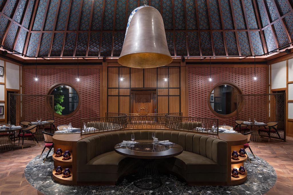
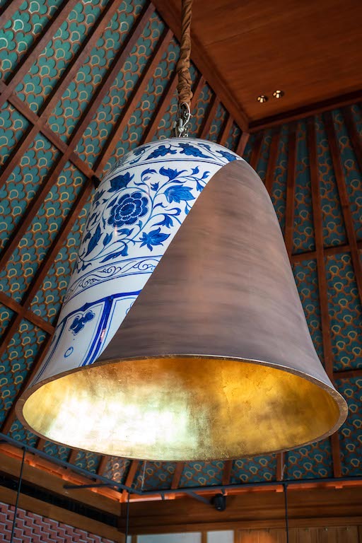
AS: One of our favourite design elements is the bell light in Li Long. A contemporary take on a traditional Ming vase is reinterpreted as a bespoke 2-metre high feature bell made of infused porcelain and timber. The feature artwork sits above the central banquette which anchors the space allowing each table to enjoy the views of the live cooking as well as the captivating scenery.
The designers collaborated with the architects to create round windows perfectly framing the bonsai trees on either side of the entrance, bringing the outside inside. The overall detailing, selection of artwork and bespoke nature of the elements breathe life into the space, truly giving the guests a sense of belonging and the intimacy of dining in someone’s home.
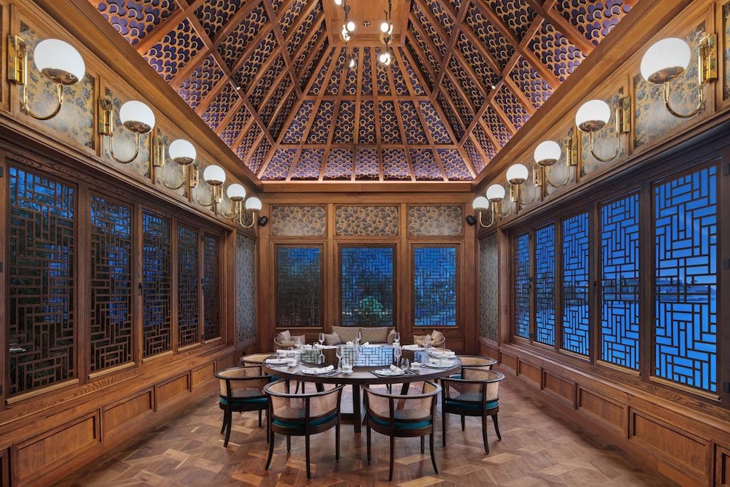 Warm brick-patterned walls, intricate brass screens and attention to detail create an authentic residential feel, while the open kitchen featuring the signature duck oven at close proximity to the intimate seating arrangement ensures that each guest is receiving a tailor-made experience. The high pitched timber roof is adorned with an iridescent green wall covering then finished with an elaborate timber screen with brass highlights.
Tell us about the materials and textures used throughout?
AS: Considering the simplicity and architecture/ interior interface for Terra and Rock, the materials were simplistic and authentic being limestone, granite, and bamboo. Li Long is a completely different story. Upon arrival into the main dining room, the guest is met with unrestricted views to the picturesque ocean views; a bespoke feature bell hangs from the high-pitched roof, adding an unexpected layer to the space. On the right side sits the open kitchen featuring the duck oven, which is perfectly framed within warm wood paneling and personalized black and white photos peppered around the space.
The restaurant sits onto the water forming an island, which proved to be difficult to treat and design with very limited walls and solid surfaces to decorate. The design needed to cater to the open windows and the importance of the surrounding views. With such an open plan and vast ceiling height, the designers were keen on creating a sense of intimacy and charm of someone’s home, without compromising the adjacent views.
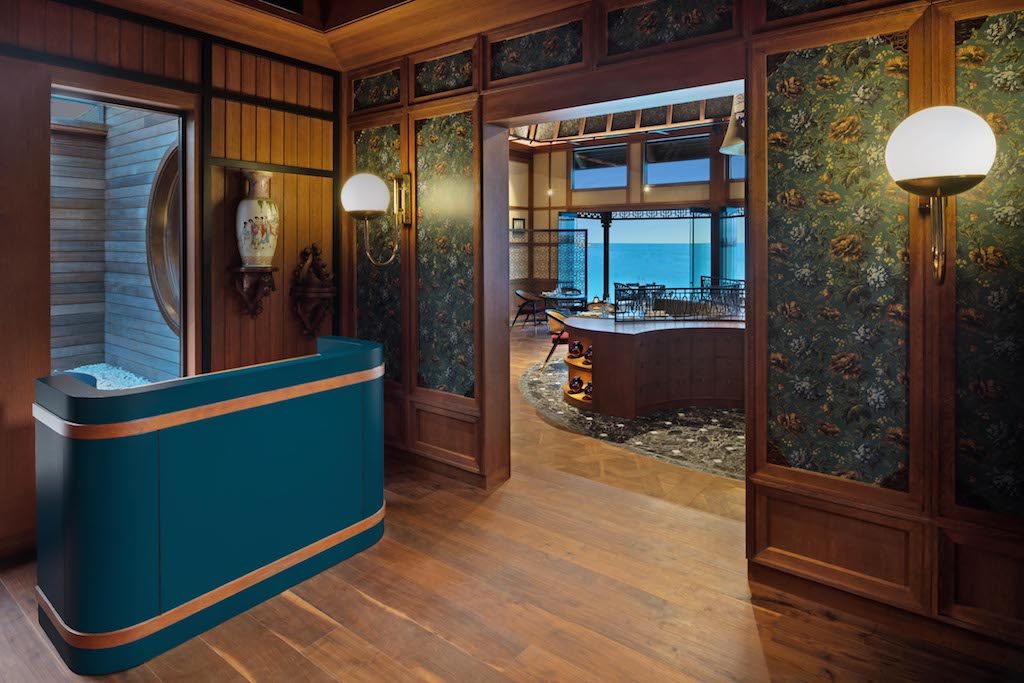 This started by anchoring the space centrally using a feature curvaceous banquette to create a sense of exploration and strategic barrier upon arrival. The high-pitched roof was designed to be an art piece in itself, with three intricate layers of materials. The iridescent green wall covering peers through the custom walnut wood screen and is complemented by the subtle polished brass touches.
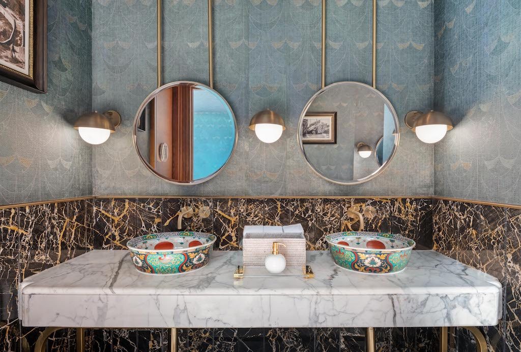
The design team wanted to veer away from a typical and expected light or chandelier and instead wanted to create a sculptural piece that acts as a light. The Ming vase- inspired sculpture marries tradition, materiality, and function. The design carries through to the washrooms, specifically designed similar to a powder room found in someone’s residence. Intricate hand-painted washbasins sit on a rich white Statuario marble counter, with rich black marble as its backdrop for contrast and an effortless sense of luxury. To ensure the guest experience is memorable and authentic, the designers personally selected every artwork, accessory, and frame adorning the space.
What stands out the most to you in this project?
AS: What we loved the most about this particular design is how different it is from our usual projects, the scope extended to architecture, landscape, artwork and everything in between. It is not every day that we get asked to design a Maldivian treehouse, an underground wine cellar, an organic farmhouse and a Shanghainese nobleman’s home. We thoroughly enjoyed every moment of the process and truly immersed ourselves into the creative process to achieve this unique result for the client and operator.
Photos: Alex Jeffries Photography Group

