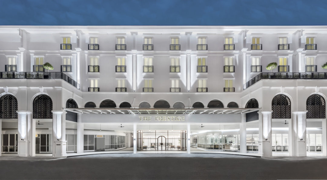
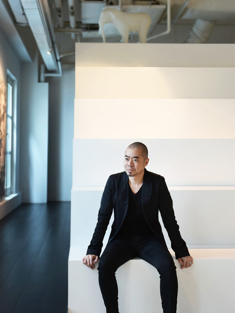
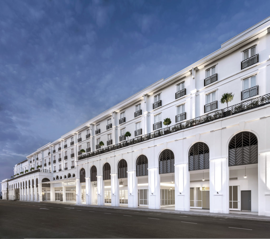
Colin Seah, one of Singapore’s globally-acclaimed talents, and founder of Ministry of Design (MOD), has recently completed The Prestige hotel in Penang’s capital Georgetown, a UNESCO World Heritage site. The property features 162 rooms, an all-day dining restaurant, a rooftop infinity pool, events pavilion and terrace, and a vibrant Victorian dining and retail arcade.
Although a new build, it draws upon the cultural relevance of the location’s colonial past while weaving in local botany for an exclusive experience. De51gn speaks to Seah, a two-time recipient of the prestigious President’s Design Award (Design of the Year), about the inspiration behind his latest project – one that is set to be one of the most sought after addresses in Penang.
 Q: What was the brief on this project?
Colin Seah (CS): The client came to know of us from our previous boutique hotel projects: Macalister Mansion and the now-defunct The New Majestic Hotel. His main concerns were programmatic – the number of rooms, F&B outlets etc, and he did not provide an aesthetic brief. He just wanted a cool hotel which would be unique in Penang and stand out among the variety of hotel offerings! 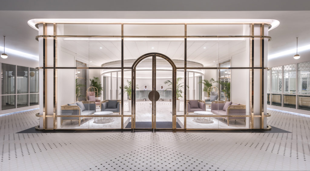 Q: You’ve worked on other heritage projects in Penang in the past such as the Macalister Mansion and the Lok Thye Kee Residences. What is distinctive about the Prestige Penang, and how is it different from the other projects?
CS: While the Macalister mansion and Loke Thye Kee Residences were adaptive reuse projects, the Prestige Hotel is a new build. There was a derelict go-down warehouse. It was in terrible shape with most of the walls and roof collapsed. It would have been interesting to use that as a starting point but unfortunately, it was in too much of a bad condition.
Considering the site’s heritage (historically a large century-old godown location used during the maritime trading era in the late 1900s), The Prestige hotel’s architectural design (by local architect KL Wong), drew inspiration from the colonial heritage of surrounding buildings in the banking district of old town Penang and Church street where it is situated.
MOD designed the interiors, branding, signage and art, and our approach was: to respect the importance of maintaining the feel of heritage, we wanted to “transpose heritage” by combining both the traditional and the modern, innovate spaces while remaining rooted in culture and location. One example would be the abstraction of traditional wainscoting and making it more contemporary.  Q: How did you re-imagine a space that seems like it would have had hundreds of years of history behind it?
CS: The main distinctive feature for this hotel is the narrative – I love how the design of The Prestige hotel tells a wonderful narrative through its spatial experience, art and design, from start to end.
In this case, it’s “A touch of magic in a Tropical, Victorian Eden”… we present The Prestige hotel as a modern interpretation of Victorian-era interior design layered with the local flora. In addition, we added elements of visual surprise through notions of illusion, as design devices to animate spaces, also taking cues from the movie “The Prestige” featuring the illusory art of magic, also set in the Victorian era.
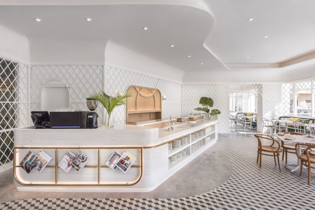
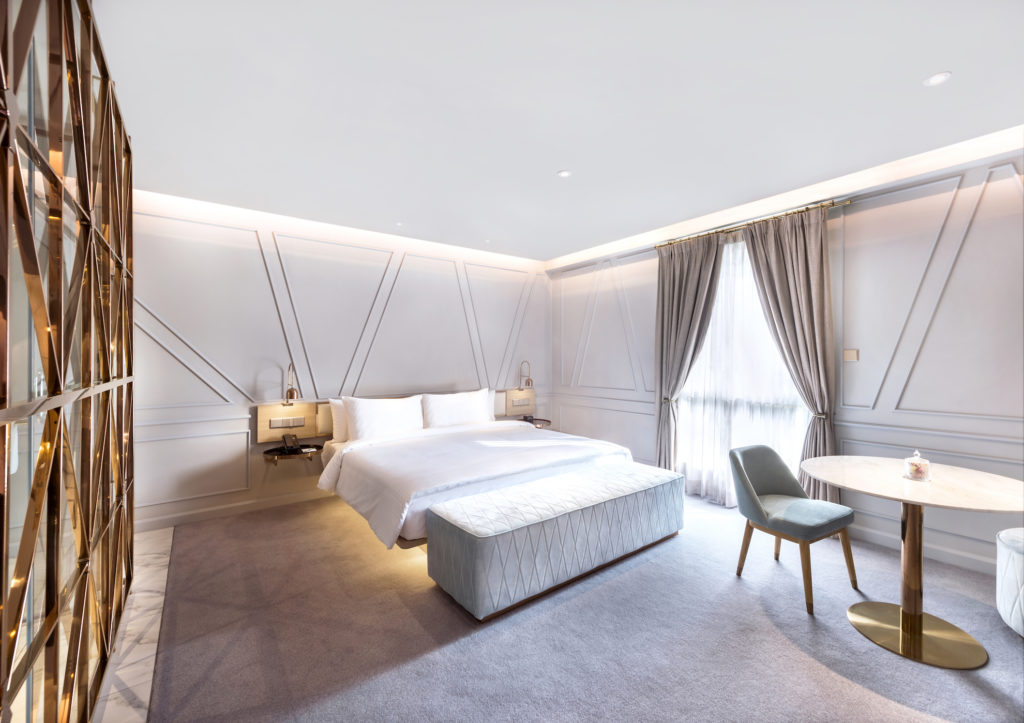
For example, in The Glasshouse restaurant, taking inspiration from the English Victorian conservatory, we applied the lattice pattern to the metal-framed walls and glazing of the restaurant, presenting it as a delightful garden conservatory for breakfasts, lunches and dinners. In the guestrooms, our modern take on Victorian wainscoting was to craft angular trapezium-shaped lines, which provide a contemporised backdrop for the room.
In the reception area, we introduced several tongue-in-cheek references to magical illusion, where guests navigate a custom-designed white marble-clad maze with brass trimmings on the floor, to get to the reception.  The custom reception desk made of mirrored stainless steel, magically appears to balance on chrome spheres, and a cloud wainscot adorns the curved wall behind the reception desk, showing a modern whimsical take on Victorian interiors. Other subtle visual trickery and surprises in the guestrooms include beds that seem to levitate and hidden doors that reveal toilet cubicles and hidden pantries.
  Q: What were the biggest challenges on this project? How did you address them?
While the colonial Victorian heritage and tropics are key elements of the design concept, the studio considered a particularly difficult condition of the site – its long narrow proportions, which potentially made navigating the hotel’s retail arcade or its long guestroom corridors a monotonous experience. 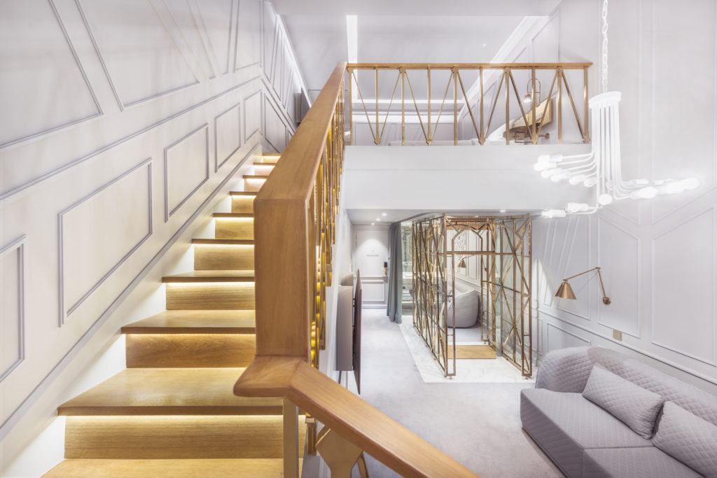 To overcome this, we introduced elements of visual trickery and surprise, notions of magic and illusions, with the end goal of creating delightful spaces and memorable guest experiences. This element of visual trickery (appearing, disappearing, and levitation) is subtly introduced throughout the hotel; ranging from the transformation of familiar heritage floor patterns, furniture design such as the custom reception desk that seems to magically balance on balls, and hidden doors in guestrooms that open to reveal toilets and pantries.
For example, the studio alternated dark and light color schemes along the guestroom corridors, to break down the potential monotony of the corridor experience. Mechanised light features were placed at regular intervals, to rotate and cast shadows of intricate lattice patterns to animate the guest journey. This visual animation and trickery (smoke and mirrors) was thus borne out of a response to the unusual specificity of the site. 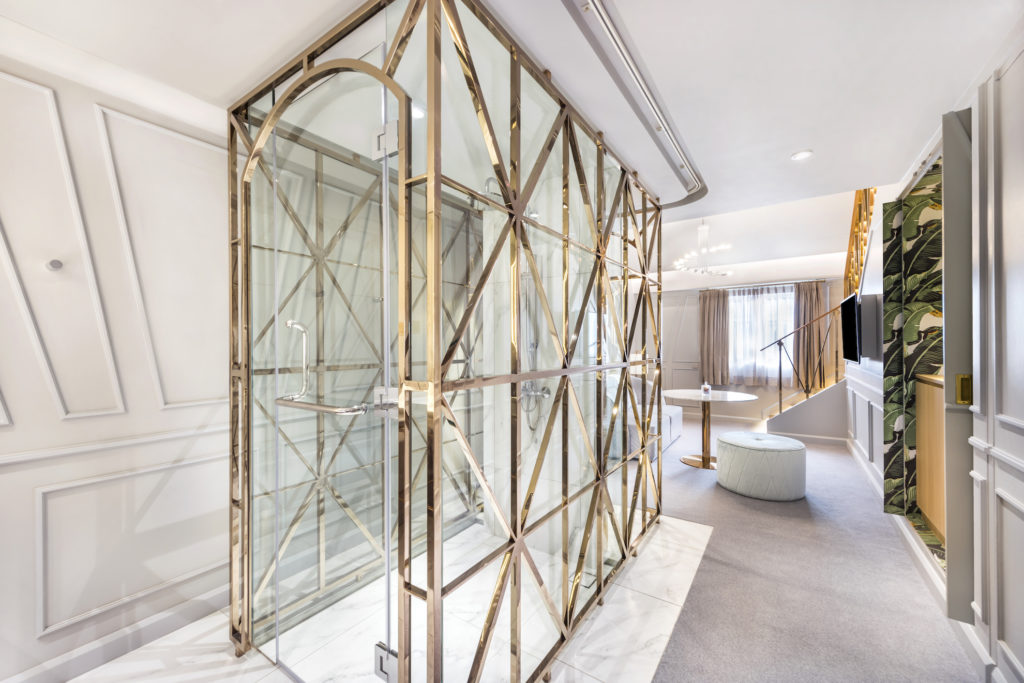 Q: What is your favourite element in the property?
A key favourite is the custom-designed shower and wardrobe enclosure in the Premier Deluxe Suite, crafted with champagne bronze-tinted metal and glass. This hero piece takes aesthetic cues from the elaborate magic props used in performances such as Houdini’s escape box.
I think it’s the sheer spectacle of the piece, whether you’re using it to shower (and become the center of attention) or whether you’re just admiring the details of it while enjoying another part of the room. The hero piece is positioned right in the middle of the room, everything revolves around it and it also gently divides the room into two halves without using any doors.

